通过编写关联的自定义设计器,可以增强自定义控件的设计时体验。
谨慎
此内容是为 .NET Framework 编写的。 如果使用 .NET 6 或更高版本,请谨慎使用此内容。 设计器系统已针对 Windows 窗体进行更改,因此请务必查看自 .NET Framework 以来对设计器所做的更改一文。
本文演示如何为自定义控件创建自定义设计器。 你将实现一个MarqueeControl类型,并一个名为MarqueeControlRootDesigner的关联设计器类。
该MarqueeControl类型实现了类似于剧院招牌的显示效果,带有动画灯光和闪烁文本。
此控件的设计器与设计环境交互,以提供自定义设计时体验。 使用自定义设计器,您可以通过多种组合方式,定制一个MarqueeControl实现,其中包含动画灯光和闪烁文本。 可以像使用任何其他 Windows 窗体控件一样在窗体上使用组合控件。
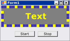
完成本演练后,自定义控件将如下所示:
有关完整的代码列表,请参阅 如何:创建利用 Design-Time 功能的 Windows 窗体控件。
先决条件
若要完成本演练,需要 Visual Studio。
创建项目
第一步是创建应用程序项目。 你将使用此项目生成托管自定义控件的应用程序。
在 Visual Studio 中,创建新的 Windows 窗体应用程序项目,并将其命名为 MarqueeControlTest。
创建控件库项目
将 Windows 窗体控件库项目添加到解决方案。 将项目命名为 MarqueeControlLibrary。
使用 解决方案资源管理器,根据所选语言删除名为“UserControl1.cs”或“UserControl1.vb”的源文件来删除项目的默认控件。
向 UserControl 项目添加新项
MarqueeControlLibrary。 为新源文件提供 MarqueeControl 的基名称。使用 解决方案资源管理器,在
MarqueeControlLibrary项目中创建新文件夹。右键单击 “设计” 文件夹并添加新类。 将其命名为 MarqueeControlRootDesigner。
需要使用 System.Design 程序集中的类型,因此请将此引用添加到
MarqueeControlLibrary项目。
引用自定义控件项目
你将使用该 MarqueeControlTest 项目来测试自定义控件。 向程序集添加项目引用 MarqueeControlLibrary 时,测试项目将了解自定义控件。
在 MarqueeControlTest 项目中,添加项目引用到 MarqueeControlLibrary 程序集。 请务必使用“添加引用”对话框中的“项目”选项卡,而不是直接引用MarqueeControlLibrary程序集。
定义自定义控件及其自定义设计器
自定义控件将派生自 UserControl 类。 这样,控件就可以包含其他控件,并且它为控件提供了大量默认功能。
自定义控件将具有关联的自定义设计器。 这样,就可以创建专为自定义控件定制的独特设计体验。
使用 DesignerAttribute 类将控件与其设计器相关联。 由于你正在开发自定义控件的整个设计时行为,因此自定义设计器将实现 IRootDesigner 该接口。
定义自定义控件及其自定义设计器
在
MarqueeControl代码编辑器中打开源文件。 在文件的顶部,导入以下命名空间:using System; using System.Collections; using System.ComponentModel; using System.ComponentModel.Design; using System.Drawing; using System.Windows.Forms; using System.Windows.Forms.Design;Imports System.Collections Imports System.ComponentModel Imports System.ComponentModel.Design Imports System.Drawing Imports System.Windows.Forms Imports System.Windows.Forms.Design将DesignerAttribute添加到
MarqueeControl类声明中。 这会将自定义控件与其设计器相关联。[Designer( typeof( MarqueeControlLibrary.Design.MarqueeControlRootDesigner ), typeof( IRootDesigner ) )] public class MarqueeControl : UserControl {<Designer(GetType(MarqueeControlLibrary.Design.MarqueeControlRootDesigner), _ GetType(IRootDesigner))> _ Public Class MarqueeControl Inherits UserControl在
MarqueeControlRootDesigner代码编辑器中打开源文件。 在文件的顶部,导入以下命名空间:using System; using System.Collections; using System.ComponentModel; using System.ComponentModel.Design; using System.Diagnostics; using System.Drawing.Design; using System.Windows.Forms; using System.Windows.Forms.Design;Imports System.Collections Imports System.ComponentModel Imports System.ComponentModel.Design Imports System.Diagnostics Imports System.Drawing.Design Imports System.Windows.Forms Imports System.Windows.Forms.Design将
MarqueeControlRootDesigner的声明更改为继承DocumentDesigner类。 使用 ToolboxItemFilterAttribute 来指定设计器与 工具箱的交互。注释
类的定义
MarqueeControlRootDesigner已包含在名为 MarqueeControlLibrary.Design 的命名空间中。 此声明将设计器置于为与设计相关的类型保留的特殊命名空间中。namespace MarqueeControlLibrary.Design { [ToolboxItemFilter("MarqueeControlLibrary.MarqueeBorder", ToolboxItemFilterType.Require)] [ToolboxItemFilter("MarqueeControlLibrary.MarqueeText", ToolboxItemFilterType.Require)] public class MarqueeControlRootDesigner : DocumentDesigner {Namespace MarqueeControlLibrary.Design <ToolboxItemFilter("MarqueeControlLibrary.MarqueeBorder", _ ToolboxItemFilterType.Require), _ ToolboxItemFilter("MarqueeControlLibrary.MarqueeText", _ ToolboxItemFilterType.Require)> _ Public Class MarqueeControlRootDesigner Inherits DocumentDesigner定义类的
MarqueeControlRootDesigner构造函数。 在构造函数正文中插入WriteLine语句。 这对于调试非常有用。public MarqueeControlRootDesigner() { Trace.WriteLine("MarqueeControlRootDesigner ctor"); }Public Sub New() Trace.WriteLine("MarqueeControlRootDesigner ctor") End Sub
创建自定义控件的实例
向 UserControl 项目添加新项
MarqueeControlTest。 为新源文件提供 DemoMarqueeControl 的基名称。在
DemoMarqueeControl代码编辑器中打开该文件。 在文件的顶部,导入MarqueeControlLibrary命名空间:Imports MarqueeControlLibraryusing MarqueeControlLibrary;将
DemoMarqueeControl的声明更改为继承MarqueeControl类。构建项目。
在 Windows 窗体设计器中打开 Form1。
在工具箱中找到“MarqueeControlTest 组件”选项卡,然后打开它。 将
DemoMarqueeControl从“工具箱”拖到窗体上。构建项目。
设置用于 Design-Time 调试的项目
开发自定义设计环境体验时,必须调试控件和组件。 可通过一种简单的方法来设置项目,以允许在设计时进行调试。 有关详细信息,请参阅 演练:在设计时调试自定义 Windows 窗体控件。
右键单击
MarqueeControlLibrary项目并选择“ 属性”。在“ MarqueeControlLibrary 属性页 ”对话框中,选择 “调试 ”页。
在启动操作部分中,选择启动外部程序。 你会调试 Visual Studio 的单独实例,因此请单击省略号 (
 ) 按钮以浏览 Visual Studio IDE。 可执行文件的名称 devenv.exe,如果安装到默认位置,则其路径 为%ProgramFiles(x86)%\Microsoft Visual Studio\2019\<edition>\Common7\IDE\devenv.exe。
选择确定关闭对话框。
右键单击 MarqueeControlLibrary 项目,然后选择“ 设为启动项目 ”以启用此调试配置。
检查站
现在,您已准备好调试自定义控件的设计时行为。 确定正确设置调试环境后,将测试自定义控件和自定义设计器之间的关联。
测试调试环境及与设计器的关联
在 代码编辑器 中打开 MarqueeControlRootDesigner 源文件,并在语句上 WriteLine 放置断点。
按 F5 启动调试会话。
会创建 Visual Studio 的新实例。
在 Visual Studio 的新实例中,打开 MarqueeControlTest 解决方案。 可以通过在 “文件” 菜单中选择 “最近项目” 来轻松找到解决方案。 MarqueeControlTest.sln解决方案文件将列为最近使用的文件。
在设计器中打开
DemoMarqueeControl。Visual Studio 的调试实例获得焦点,并且在断点处停止执行。 按 F5 继续调试会话。
此时,所有内容都可供你开发和调试自定义控件及其关联的自定义设计器。 本文的其余部分侧重于实现控件和设计器的功能的详细信息。
实现自定义控件
这是一个稍作定制的MarqueeControlUserControl。 它公开两种方法: Start启动选美动画,并 Stop停止动画。
MarqueeControl因为包含实现接口的IMarqueeWidget子控件,Start并Stop分别枚举每个子控件并分别对实现StartMarquee的每个子控件调用StopMarquee和IMarqueeWidget方法。
控件MarqueeBorder和MarqueeText的外观取决于布局,因此MarqueeControl重写OnLayout方法,并对该类型的子控件调用PerformLayout。
这就是 MarqueeControl 自定义的程度。 运行时功能由MarqueeBorderMarqueeText控件实现,设计时功能由MarqueeBorderDesigner类MarqueeControlRootDesigner实现。
实现自定义控件
在
MarqueeControl代码编辑器中打开源文件。 实现Start和Stop方法。public void Start() { // The MarqueeControl may contain any number of // controls that implement IMarqueeWidget, so // find each IMarqueeWidget child and call its // StartMarquee method. foreach( Control cntrl in this.Controls ) { if( cntrl is IMarqueeWidget ) { IMarqueeWidget widget = cntrl as IMarqueeWidget; widget.StartMarquee(); } } } public void Stop() { // The MarqueeControl may contain any number of // controls that implement IMarqueeWidget, so find // each IMarqueeWidget child and call its StopMarquee // method. foreach( Control cntrl in this.Controls ) { if( cntrl is IMarqueeWidget ) { IMarqueeWidget widget = cntrl as IMarqueeWidget; widget.StopMarquee(); } } }Public Sub Start() ' The MarqueeControl may contain any number of ' controls that implement IMarqueeWidget, so ' find each IMarqueeWidget child and call its ' StartMarquee method. Dim cntrl As Control For Each cntrl In Me.Controls If TypeOf cntrl Is IMarqueeWidget Then Dim widget As IMarqueeWidget = CType(cntrl, IMarqueeWidget) widget.StartMarquee() End If Next cntrl End Sub Public Sub [Stop]() ' The MarqueeControl may contain any number of ' controls that implement IMarqueeWidget, so find ' each IMarqueeWidget child and call its StopMarquee ' method. Dim cntrl As Control For Each cntrl In Me.Controls If TypeOf cntrl Is IMarqueeWidget Then Dim widget As IMarqueeWidget = CType(cntrl, IMarqueeWidget) widget.StopMarquee() End If Next cntrl End Sub重写 OnLayout 方法。
protected override void OnLayout(LayoutEventArgs levent)
{
    base.OnLayout (levent);

    // Repaint all IMarqueeWidget children if the layout
    // has changed.
    foreach( Control cntrl in this.Controls )
    {
        if( cntrl is IMarqueeWidget )
        {
            Control control = cntrl as Control;

            control.PerformLayout();
        }
    }
}
Protected Overrides Sub OnLayout(ByVal levent As LayoutEventArgs) MyBase.OnLayout(levent) ' Repaint all IMarqueeWidget children if the layout ' has changed. Dim cntrl As Control For Each cntrl In Me.Controls If TypeOf cntrl Is IMarqueeWidget Then Dim widget As IMarqueeWidget = CType(cntrl, IMarqueeWidget) cntrl.PerformLayout() End If Next cntrl End Sub
为自定义控件创建子控件
将 MarqueeControl 承载两种类型的子控件:MarqueeBorder 控件和 MarqueeText 控件。
MarqueeBorder:此控件在其边缘上绘制“灯光”边框。 灯按顺序闪烁,因此它们似乎在边框周围移动。 灯闪烁的速度由一个名为UpdatePeriod的属性控制。 其他几个自定义属性确定控件外观的其他方面。 动画启动和停止时的两种方法(调用StartMarquee和StopMarquee控制)。MarqueeText:此控件绘制闪烁的字符串。MarqueeBorder与控件一样,文本闪烁的速度由UpdatePeriod属性控制。 该MarqueeText控件与StartMarquee控件共享相同的StopMarquee和MarqueeBorder方法。
在设计时, MarqueeControlRootDesigner 允许将这两种 MarqueeControl 控件类型添加到任意组合中。
这两个控件的常见功能被整合到一个名为IMarqueeWidget的接口中。
MarqueeControl这样就可以发现任何与 Marquee 相关的儿童控件,并给予他们特殊的待遇。
若要实现定期动画功能,将使用 BackgroundWorker 命名空间中的 System.ComponentModel 对象。 可以使用 Timer 对象,但当存在许多 IMarqueeWidget 对象时,单个 UI 线程可能无法跟上动画。
为自定义控件创建子控件
向项目添加新的类项
MarqueeControlLibrary。 为新源文件提供“IMarqueeWidget”的基名称。在
IMarqueeWidget中打开源文件,并将声明从以下项class更改为interface:// This interface defines the contract for any class that is to // be used in constructing a MarqueeControl. public interface IMarqueeWidget {' This interface defines the contract for any class that is to ' be used in constructing a MarqueeControl. Public Interface IMarqueeWidget将以下代码添加到
IMarqueeWidget接口,以公开两个方法和一个操控跑马灯动画的属性。// This interface defines the contract for any class that is to // be used in constructing a MarqueeControl. public interface IMarqueeWidget { // This method starts the animation. If the control can // contain other classes that implement IMarqueeWidget as // children, the control should call StartMarquee on all // its IMarqueeWidget child controls. void StartMarquee(); // This method stops the animation. If the control can // contain other classes that implement IMarqueeWidget as // children, the control should call StopMarquee on all // its IMarqueeWidget child controls. void StopMarquee(); // This method specifies the refresh rate for the animation, // in milliseconds. int UpdatePeriod { get; set; } }' This interface defines the contract for any class that is to ' be used in constructing a MarqueeControl. Public Interface IMarqueeWidget ' This method starts the animation. If the control can ' contain other classes that implement IMarqueeWidget as ' children, the control should call StartMarquee on all ' its IMarqueeWidget child controls. Sub StartMarquee() ' This method stops the animation. If the control can ' contain other classes that implement IMarqueeWidget as ' children, the control should call StopMarquee on all ' its IMarqueeWidget child controls. Sub StopMarquee() ' This method specifies the refresh rate for the animation, ' in milliseconds. Property UpdatePeriod() As Integer End Interface向项目添加新的 自定义控件 项
MarqueeControlLibrary。 为新源文件提供“MarqueeText”的基名称。将 BackgroundWorker 组件从 工具箱 拖到控件
MarqueeText上。 此组件允许MarqueeText控件以异步方式更新自身。在 “属性” 窗口中,将 BackgroundWorker 组件的
WorkerReportsProgress和 WorkerSupportsCancellation 属性设置为 true。 这些设置允许 BackgroundWorker 组件定期引发 ProgressChanged 事件并取消异步更新。有关详细信息,请参阅 BackgroundWorker 组件。
在
MarqueeText代码编辑器中打开源文件。 在文件的顶部,导入以下命名空间:using System; using System.ComponentModel; using System.ComponentModel.Design; using System.Diagnostics; using System.Drawing; using System.Threading; using System.Windows.Forms; using System.Windows.Forms.Design;Imports System.ComponentModel Imports System.ComponentModel.Design Imports System.Diagnostics Imports System.Drawing Imports System.Threading Imports System.Windows.Forms Imports System.Windows.Forms.Design更改
MarqueeText的声明,使其继承自Label并实现IMarqueeWidget接口。[ToolboxItemFilter("MarqueeControlLibrary.MarqueeText", ToolboxItemFilterType.Require)] public partial class MarqueeText : Label, IMarqueeWidget {<ToolboxItemFilter("MarqueeControlLibrary.MarqueeText", _ ToolboxItemFilterType.Require)> _ Partial Public Class MarqueeText Inherits Label Implements IMarqueeWidget声明对应于公开属性的实例变量,并在构造函数中初始化它们。 该
isLit字段决定文本是否使用由LightColor属性指定的颜色进行绘制。// When isLit is true, the text is painted in the light color; // When isLit is false, the text is painted in the dark color. // This value changes whenever the BackgroundWorker component // raises the ProgressChanged event. private bool isLit = true; // These fields back the public properties. private int updatePeriodValue = 50; private Color lightColorValue; private Color darkColorValue; // These brushes are used to paint the light and dark // colors of the text. private Brush lightBrush; private Brush darkBrush; // This component updates the control asynchronously. private BackgroundWorker backgroundWorker1; public MarqueeText() { // This call is required by the Windows.Forms Form Designer. InitializeComponent(); // Initialize light and dark colors // to the control's default values. this.lightColorValue = this.ForeColor; this.darkColorValue = this.BackColor; this.lightBrush = new SolidBrush(this.lightColorValue); this.darkBrush = new SolidBrush(this.darkColorValue); }' When isLit is true, the text is painted in the light color; ' When isLit is false, the text is painted in the dark color. ' This value changes whenever the BackgroundWorker component ' raises the ProgressChanged event. Private isLit As Boolean = True ' These fields back the public properties. Private updatePeriodValue As Integer = 50 Private lightColorValue As Color Private darkColorValue As Color ' These brushes are used to paint the light and dark ' colors of the text. Private lightBrush As Brush Private darkBrush As Brush ' This component updates the control asynchronously. Private WithEvents backgroundWorker1 As BackgroundWorker Public Sub New() ' This call is required by the Windows.Forms Form Designer. InitializeComponent() ' Initialize light and dark colors ' to the control's default values. Me.lightColorValue = Me.ForeColor Me.darkColorValue = Me.BackColor Me.lightBrush = New SolidBrush(Me.lightColorValue) Me.darkBrush = New SolidBrush(Me.darkColorValue) End Sub实现
IMarqueeWidget接口。和
StartMarqueeStopMarquee方法调用BackgroundWorker组件的RunWorkerAsync和CancelAsync方法来启动和停止动画。Category和Browsable属性将应用于
UpdatePeriod属性,以便它出现在“属性”窗口名为“Marquee”的自定义部分中。public virtual void StartMarquee() { // Start the updating thread and pass it the UpdatePeriod. this.backgroundWorker1.RunWorkerAsync(this.UpdatePeriod); } public virtual void StopMarquee() { // Stop the updating thread. this.backgroundWorker1.CancelAsync(); } [Category("Marquee")] [Browsable(true)] public int UpdatePeriod { get { return this.updatePeriodValue; } set { if (value > 0) { this.updatePeriodValue = value; } else { throw new ArgumentOutOfRangeException("UpdatePeriod", "must be > 0"); } } }Public Overridable Sub StartMarquee() _ Implements IMarqueeWidget.StartMarquee ' Start the updating thread and pass it the UpdatePeriod. Me.backgroundWorker1.RunWorkerAsync(Me.UpdatePeriod) End Sub Public Overridable Sub StopMarquee() _ Implements IMarqueeWidget.StopMarquee ' Stop the updating thread. Me.backgroundWorker1.CancelAsync() End Sub <Category("Marquee"), Browsable(True)> _ Public Property UpdatePeriod() As Integer _ Implements IMarqueeWidget.UpdatePeriod Get Return Me.updatePeriodValue End Get Set(ByVal Value As Integer) If Value > 0 Then Me.updatePeriodValue = Value Else Throw New ArgumentOutOfRangeException("UpdatePeriod", "must be > 0") End If End Set End Property实现属性访问器。 你将向客户端公开两个属性:
LightColor和DarkColor。 这些 Category 属性和 Browsable 属性将应用于这些属性,因此这些属性将显示在名为“Marquee”的“属性”窗口的自定义部分中。[Category("Marquee")] [Browsable(true)] public Color LightColor { get { return this.lightColorValue; } set { // The LightColor property is only changed if the // client provides a different value. Comparing values // from the ToArgb method is the recommended test for // equality between Color structs. if (this.lightColorValue.ToArgb() != value.ToArgb()) { this.lightColorValue = value; this.lightBrush = new SolidBrush(value); } } } [Category("Marquee")] [Browsable(true)] public Color DarkColor { get { return this.darkColorValue; } set { // The DarkColor property is only changed if the // client provides a different value. Comparing values // from the ToArgb method is the recommended test for // equality between Color structs. if (this.darkColorValue.ToArgb() != value.ToArgb()) { this.darkColorValue = value; this.darkBrush = new SolidBrush(value); } } }<Category("Marquee"), Browsable(True)> _ Public Property LightColor() As Color Get Return Me.lightColorValue End Get Set(ByVal Value As Color) ' The LightColor property is only changed if the ' client provides a different value. Comparing values ' from the ToArgb method is the recommended test for ' equality between Color structs. If Me.lightColorValue.ToArgb() <> Value.ToArgb() Then Me.lightColorValue = Value Me.lightBrush = New SolidBrush(Value) End If End Set End Property <Category("Marquee"), Browsable(True)> _ Public Property DarkColor() As Color Get Return Me.darkColorValue End Get Set(ByVal Value As Color) ' The DarkColor property is only changed if the ' client provides a different value. Comparing values ' from the ToArgb method is the recommended test for ' equality between Color structs. If Me.darkColorValue.ToArgb() <> Value.ToArgb() Then Me.darkColorValue = Value Me.darkBrush = New SolidBrush(Value) End If End Set End Property为 BackgroundWorker 组件实现 DoWork 和 ProgressChanged 事件的处理程序。
DoWork事件处理程序先休眠指定的
UpdatePeriod毫秒数,然后触发ProgressChanged事件,直到你的代码调用CancelAsync停止动画为止。ProgressChanged事件处理程序在其浅色和深色状态之间切换文本,以呈现闪烁的外观。
// This method is called in the worker thread's context,
// so it must not make any calls into the MarqueeText control.
// Instead, it communicates to the control using the
// ProgressChanged event.
//
// The only work done in this event handler is
// to sleep for the number of milliseconds specified
// by UpdatePeriod, then raise the ProgressChanged event.
private void backgroundWorker1_DoWork(
    object sender,
    System.ComponentModel.DoWorkEventArgs e)
{
    BackgroundWorker worker = sender as BackgroundWorker;

    // This event handler will run until the client cancels
    // the background task by calling CancelAsync.
    while (!worker.CancellationPending)
    {
        // The Argument property of the DoWorkEventArgs
        // object holds the value of UpdatePeriod, which
        // was passed as the argument to the RunWorkerAsync
        // method.
        Thread.Sleep((int)e.Argument);

        // The DoWork eventhandler does not actually report
        // progress; the ReportProgress event is used to
        // periodically alert the control to update its state.
        worker.ReportProgress(0);
    }
}

// The ProgressChanged event is raised by the DoWork method.
// This event handler does work that is internal to the
// control. In this case, the text is toggled between its
// light and dark state, and the control is told to
// repaint itself.
private void backgroundWorker1_ProgressChanged(object sender, System.ComponentModel.ProgressChangedEventArgs e)
{
    this.isLit = !this.isLit;
    this.Refresh();
}
' This method is called in the worker thread's context, ' so it must not make any calls into the MarqueeText control. ' Instead, it communicates to the control using the ' ProgressChanged event. ' ' The only work done in this event handler is ' to sleep for the number of milliseconds specified ' by UpdatePeriod, then raise the ProgressChanged event. Private Sub backgroundWorker1_DoWork( _ ByVal sender As Object, _ ByVal e As System.ComponentModel.DoWorkEventArgs) _ Handles backgroundWorker1.DoWork Dim worker As BackgroundWorker = CType(sender, BackgroundWorker) ' This event handler will run until the client cancels ' the background task by calling CancelAsync. While Not worker.CancellationPending ' The Argument property of the DoWorkEventArgs ' object holds the value of UpdatePeriod, which ' was passed as the argument to the RunWorkerAsync ' method. Thread.Sleep(Fix(e.Argument)) ' The DoWork eventhandler does not actually report ' progress; the ReportProgress event is used to ' periodically alert the control to update its state. worker.ReportProgress(0) End While End Sub ' The ProgressChanged event is raised by the DoWork method. ' This event handler does work that is internal to the ' control. In this case, the text is toggled between its ' light and dark state, and the control is told to ' repaint itself. Private Sub backgroundWorker1_ProgressChanged( _ ByVal sender As Object, _ ByVal e As System.ComponentModel.ProgressChangedEventArgs) _ Handles backgroundWorker1.ProgressChanged Me.isLit = Not Me.isLit Me.Refresh() End Sub重写OnPaint方法以启用动画。
protected override void OnPaint(PaintEventArgs e)
{
    // The text is painted in the light or dark color,
    // depending on the current value of isLit.
    this.ForeColor =
        this.isLit ? this.lightColorValue : this.darkColorValue;

    base.OnPaint(e);
}
Protected Overrides Sub OnPaint(ByVal e As PaintEventArgs) ' The text is painted in the light or dark color, ' depending on the current value of isLit. Me.ForeColor = IIf(Me.isLit, Me.lightColorValue, Me.darkColorValue) MyBase.OnPaint(e) End Sub按 F6 生成解决方案。
创建 MarqueeBorder 子控件
控件 MarqueeBorder 比 MarqueeText 控件稍微复杂一些。 它具有更多的属性,并且该方法中的 OnPaint 动画更加复杂。 原则上,它与控件非常相似 MarqueeText 。
控件MarqueeBorder因为可以拥有子控件,所以需要关注Layout事件。
创建 MarqueeBorder 控件
向项目添加新的 自定义控件 项
MarqueeControlLibrary。 为新源文件提供“MarqueeBorder”的基名称。将 BackgroundWorker 组件从 工具箱 拖到控件
MarqueeBorder上。 此组件允许MarqueeBorder控件以异步方式更新自身。在 “属性” 窗口中,将 BackgroundWorker 组件的
WorkerReportsProgress和 WorkerSupportsCancellation 属性设置为 true。 这些设置允许 BackgroundWorker 组件定期引发 ProgressChanged 事件并取消异步更新。 有关详细信息,请参阅 BackgroundWorker 组件。在 “属性” 窗口中,选择“ 事件 ”按钮。 为DoWork和ProgressChanged事件附加处理程序。
在
MarqueeBorder代码编辑器中打开源文件。 在文件的顶部,导入以下命名空间:using System; using System.ComponentModel; using System.ComponentModel.Design; using System.Diagnostics; using System.Drawing; using System.Drawing.Design; using System.Threading; using System.Windows.Forms; using System.Windows.Forms.Design;Imports System.ComponentModel Imports System.ComponentModel.Design Imports System.Diagnostics Imports System.Drawing Imports System.Drawing.Design Imports System.Threading Imports System.Windows.Forms Imports System.Windows.Forms.Design将
MarqueeBorder的声明更改为从Panel继承并实现IMarqueeWidget接口。[Designer(typeof(MarqueeControlLibrary.Design.MarqueeBorderDesigner ))] [ToolboxItemFilter("MarqueeControlLibrary.MarqueeBorder", ToolboxItemFilterType.Require)] public partial class MarqueeBorder : Panel, IMarqueeWidget {<Designer(GetType(MarqueeControlLibrary.Design.MarqueeBorderDesigner)), _ ToolboxItemFilter("MarqueeControlLibrary.MarqueeBorder", _ ToolboxItemFilterType.Require)> _ Partial Public Class MarqueeBorder Inherits Panel Implements IMarqueeWidget声明用于管理
MarqueeBorder控件状态的两个枚举:MarqueeSpinDirection它确定边框周围的灯光“旋转”的方向,以及MarqueeLightShape确定灯光(方块或圆形)的形状。 将这些声明放在类声明之前MarqueeBorder。// This defines the possible values for the MarqueeBorder // control's SpinDirection property. public enum MarqueeSpinDirection { CW, CCW } // This defines the possible values for the MarqueeBorder // control's LightShape property. public enum MarqueeLightShape { Square, Circle }' This defines the possible values for the MarqueeBorder ' control's SpinDirection property. Public Enum MarqueeSpinDirection CW CCW End Enum ' This defines the possible values for the MarqueeBorder ' control's LightShape property. Public Enum MarqueeLightShape Square Circle End Enum声明对应于公开属性的实例变量,并在构造函数中初始化它们。
public static int MaxLightSize = 10;

// These fields back the public properties.
private int updatePeriodValue = 50;
private int lightSizeValue = 5;
private int lightPeriodValue = 3;
private int lightSpacingValue = 1;
private Color lightColorValue;
private Color darkColorValue;
private MarqueeSpinDirection spinDirectionValue = MarqueeSpinDirection.CW;
private MarqueeLightShape lightShapeValue = MarqueeLightShape.Square;

// These brushes are used to paint the light and dark
// colors of the marquee lights.
private Brush lightBrush;
private Brush darkBrush;

// This field tracks the progress of the "first" light as it
// "travels" around the marquee border.
private int currentOffset = 0;

// This component updates the control asynchronously.
private System.ComponentModel.BackgroundWorker backgroundWorker1;

public MarqueeBorder()
{
    // This call is required by the Windows.Forms Form Designer.
    InitializeComponent();

    // Initialize light and dark colors
    // to the control's default values.
    this.lightColorValue = this.ForeColor;
    this.darkColorValue = this.BackColor;
    this.lightBrush = new SolidBrush(this.lightColorValue);
    this.darkBrush = new SolidBrush(this.darkColorValue);

    // The MarqueeBorder control manages its own padding,
    // because it requires that any contained controls do
    // not overlap any of the marquee lights.
    int pad = 2 * (this.lightSizeValue + this.lightSpacingValue);
    this.Padding = new Padding(pad, pad, pad, pad);

    SetStyle(ControlStyles.OptimizedDoubleBuffer, true);
}
Public Shared MaxLightSize As Integer = 10 ' These fields back the public properties. Private updatePeriodValue As Integer = 50 Private lightSizeValue As Integer = 5 Private lightPeriodValue As Integer = 3 Private lightSpacingValue As Integer = 1 Private lightColorValue As Color Private darkColorValue As Color Private spinDirectionValue As MarqueeSpinDirection = MarqueeSpinDirection.CW Private lightShapeValue As MarqueeLightShape = MarqueeLightShape.Square ' These brushes are used to paint the light and dark ' colors of the marquee lights. Private lightBrush As Brush Private darkBrush As Brush ' This field tracks the progress of the "first" light as it ' "travels" around the marquee border. Private currentOffset As Integer = 0 ' This component updates the control asynchronously. Private WithEvents backgroundWorker1 As System.ComponentModel.BackgroundWorker Public Sub New() ' This call is required by the Windows.Forms Form Designer. InitializeComponent() ' Initialize light and dark colors ' to the control's default values. Me.lightColorValue = Me.ForeColor Me.darkColorValue = Me.BackColor Me.lightBrush = New SolidBrush(Me.lightColorValue) Me.darkBrush = New SolidBrush(Me.darkColorValue) ' The MarqueeBorder control manages its own padding, ' because it requires that any contained controls do ' not overlap any of the marquee lights. Dim pad As Integer = 2 * (Me.lightSizeValue + Me.lightSpacingValue) Me.Padding = New Padding(pad, pad, pad, pad) SetStyle(ControlStyles.OptimizedDoubleBuffer, True) End Sub实现
IMarqueeWidget接口。和
StartMarqueeStopMarquee方法调用BackgroundWorker组件的RunWorkerAsync和CancelAsync方法来启动和停止动画。由于
MarqueeBorder控件可以包含子控件,StartMarquee方法会枚举所有子控件,并对那些实现了StartMarquee的控件调用IMarqueeWidget。 该方法StopMarquee具有类似的实现。public virtual void StartMarquee() { // The MarqueeBorder control may contain any number of // controls that implement IMarqueeWidget, so find // each IMarqueeWidget child and call its StartMarquee // method. foreach (Control cntrl in this.Controls) { if (cntrl is IMarqueeWidget) { IMarqueeWidget widget = cntrl as IMarqueeWidget; widget.StartMarquee(); } } // Start the updating thread and pass it the UpdatePeriod. this.backgroundWorker1.RunWorkerAsync(this.UpdatePeriod); } public virtual void StopMarquee() { // The MarqueeBorder control may contain any number of // controls that implement IMarqueeWidget, so find // each IMarqueeWidget child and call its StopMarquee // method. foreach (Control cntrl in this.Controls) { if (cntrl is IMarqueeWidget) { IMarqueeWidget widget = cntrl as IMarqueeWidget; widget.StopMarquee(); } } // Stop the updating thread. this.backgroundWorker1.CancelAsync(); } [Category("Marquee")] [Browsable(true)] public virtual int UpdatePeriod { get { return this.updatePeriodValue; } set { if (value > 0) { this.updatePeriodValue = value; } else { throw new ArgumentOutOfRangeException("UpdatePeriod", "must be > 0"); } } }Public Overridable Sub StartMarquee() _ Implements IMarqueeWidget.StartMarquee ' The MarqueeBorder control may contain any number of ' controls that implement IMarqueeWidget, so find ' each IMarqueeWidget child and call its StartMarquee ' method. Dim cntrl As Control For Each cntrl In Me.Controls If TypeOf cntrl Is IMarqueeWidget Then Dim widget As IMarqueeWidget = CType(cntrl, IMarqueeWidget) widget.StartMarquee() End If Next cntrl ' Start the updating thread and pass it the UpdatePeriod. Me.backgroundWorker1.RunWorkerAsync(Me.UpdatePeriod) End Sub Public Overridable Sub StopMarquee() _ Implements IMarqueeWidget.StopMarquee ' The MarqueeBorder control may contain any number of ' controls that implement IMarqueeWidget, so find ' each IMarqueeWidget child and call its StopMarquee ' method. Dim cntrl As Control For Each cntrl In Me.Controls If TypeOf cntrl Is IMarqueeWidget Then Dim widget As IMarqueeWidget = CType(cntrl, IMarqueeWidget) widget.StopMarquee() End If Next cntrl ' Stop the updating thread. Me.backgroundWorker1.CancelAsync() End Sub <Category("Marquee"), Browsable(True)> _ Public Overridable Property UpdatePeriod() As Integer _ Implements IMarqueeWidget.UpdatePeriod Get Return Me.updatePeriodValue End Get Set(ByVal Value As Integer) If Value > 0 Then Me.updatePeriodValue = Value Else Throw New ArgumentOutOfRangeException("UpdatePeriod", _ "must be > 0") End If End Set End Property实现属性访问器。 控件
MarqueeBorder具有多个用于控制其外观的属性。[Category("Marquee")] [Browsable(true)] public int LightSize { get { return this.lightSizeValue; } set { if (value > 0 && value <= MaxLightSize) { this.lightSizeValue = value; this.DockPadding.All = 2 * value; } else { throw new ArgumentOutOfRangeException("LightSize", "must be > 0 and < MaxLightSize"); } } } [Category("Marquee")] [Browsable(true)] public int LightPeriod { get { return this.lightPeriodValue; } set { if (value > 0) { this.lightPeriodValue = value; } else { throw new ArgumentOutOfRangeException("LightPeriod", "must be > 0 "); } } } [Category("Marquee")] [Browsable(true)] public Color LightColor { get { return this.lightColorValue; } set { // The LightColor property is only changed if the // client provides a different value. Comparing values // from the ToArgb method is the recommended test for // equality between Color structs. if (this.lightColorValue.ToArgb() != value.ToArgb()) { this.lightColorValue = value; this.lightBrush = new SolidBrush(value); } } } [Category("Marquee")] [Browsable(true)] public Color DarkColor { get { return this.darkColorValue; } set { // The DarkColor property is only changed if the // client provides a different value. Comparing values // from the ToArgb method is the recommended test for // equality between Color structs. if (this.darkColorValue.ToArgb() != value.ToArgb()) { this.darkColorValue = value; this.darkBrush = new SolidBrush(value); } } } [Category("Marquee")] [Browsable(true)] public int LightSpacing { get { return this.lightSpacingValue; } set { if (value >= 0) { this.lightSpacingValue = value; } else { throw new ArgumentOutOfRangeException("LightSpacing", "must be >= 0"); } } } [Category("Marquee")] [Browsable(true)] [EditorAttribute(typeof(LightShapeEditor), typeof(System.Drawing.Design.UITypeEditor))] public MarqueeLightShape LightShape { get { return this.lightShapeValue; } set { this.lightShapeValue = value; } } [Category("Marquee")] [Browsable(true)] public MarqueeSpinDirection SpinDirection { get { return this.spinDirectionValue; } set { this.spinDirectionValue = value; } }<Category("Marquee"), Browsable(True)> _ Public Property LightSize() As Integer Get Return Me.lightSizeValue End Get Set(ByVal Value As Integer) If Value > 0 AndAlso Value <= MaxLightSize Then Me.lightSizeValue = Value Me.DockPadding.All = 2 * Value Else Throw New ArgumentOutOfRangeException("LightSize", _ "must be > 0 and < MaxLightSize") End If End Set End Property <Category("Marquee"), Browsable(True)> _ Public Property LightPeriod() As Integer Get Return Me.lightPeriodValue End Get Set(ByVal Value As Integer) If Value > 0 Then Me.lightPeriodValue = Value Else Throw New ArgumentOutOfRangeException("LightPeriod", _ "must be > 0 ") End If End Set End Property <Category("Marquee"), Browsable(True)> _ Public Property LightColor() As Color Get Return Me.lightColorValue End Get Set(ByVal Value As Color) ' The LightColor property is only changed if the ' client provides a different value. Comparing values ' from the ToArgb method is the recommended test for ' equality between Color structs. If Me.lightColorValue.ToArgb() <> Value.ToArgb() Then Me.lightColorValue = Value Me.lightBrush = New SolidBrush(Value) End If End Set End Property <Category("Marquee"), Browsable(True)> _ Public Property DarkColor() As Color Get Return Me.darkColorValue End Get Set(ByVal Value As Color) ' The DarkColor property is only changed if the ' client provides a different value. Comparing values ' from the ToArgb method is the recommended test for ' equality between Color structs. If Me.darkColorValue.ToArgb() <> Value.ToArgb() Then Me.darkColorValue = Value Me.darkBrush = New SolidBrush(Value) End If End Set End Property <Category("Marquee"), Browsable(True)> _ Public Property LightSpacing() As Integer Get Return Me.lightSpacingValue End Get Set(ByVal Value As Integer) If Value >= 0 Then Me.lightSpacingValue = Value Else Throw New ArgumentOutOfRangeException("LightSpacing", _ "must be >= 0") End If End Set End Property <Category("Marquee"), Browsable(True), _ EditorAttribute(GetType(LightShapeEditor), _ GetType(System.Drawing.Design.UITypeEditor))> _ Public Property LightShape() As MarqueeLightShape Get Return Me.lightShapeValue End Get Set(ByVal Value As MarqueeLightShape) Me.lightShapeValue = Value End Set End Property <Category("Marquee"), Browsable(True)> _ Public Property SpinDirection() As MarqueeSpinDirection Get Return Me.spinDirectionValue End Get Set(ByVal Value As MarqueeSpinDirection) Me.spinDirectionValue = Value End Set End Property为 BackgroundWorker 组件实现 DoWork 和 ProgressChanged 事件的处理程序。
DoWork事件处理程序先休眠指定的
UpdatePeriod毫秒数,然后触发ProgressChanged事件,直到你的代码调用CancelAsync停止动画为止。ProgressChanged事件处理程序增加“base”灯的位置,该灯的位置影响其他灯的明暗状态,并调用Refresh方法以使控件重新绘制自身。
// This method is called in the worker thread's context,
// so it must not make any calls into the MarqueeBorder
// control. Instead, it communicates to the control using
// the ProgressChanged event.
//
// The only work done in this event handler is
// to sleep for the number of milliseconds specified
// by UpdatePeriod, then raise the ProgressChanged event.
private void backgroundWorker1_DoWork(object sender, System.ComponentModel.DoWorkEventArgs e)
{
    BackgroundWorker worker = sender as BackgroundWorker;

    // This event handler will run until the client cancels
    // the background task by calling CancelAsync.
    while (!worker.CancellationPending)
    {
        // The Argument property of the DoWorkEventArgs
        // object holds the value of UpdatePeriod, which
        // was passed as the argument to the RunWorkerAsync
        // method.
        Thread.Sleep((int)e.Argument);

        // The DoWork eventhandler does not actually report
        // progress; the ReportProgress event is used to
        // periodically alert the control to update its state.
        worker.ReportProgress(0);
    }
}

// The ProgressChanged event is raised by the DoWork method.
// This event handler does work that is internal to the
// control. In this case, the currentOffset is incremented,
// and the control is told to repaint itself.
private void backgroundWorker1_ProgressChanged(
    object sender,
    System.ComponentModel.ProgressChangedEventArgs e)
{
    this.currentOffset++;
    this.Refresh();
}
' This method is called in the worker thread's context, ' so it must not make any calls into the MarqueeBorder ' control. Instead, it communicates to the control using ' the ProgressChanged event. ' ' The only work done in this event handler is ' to sleep for the number of milliseconds specified ' by UpdatePeriod, then raise the ProgressChanged event. Private Sub backgroundWorker1_DoWork( _ ByVal sender As Object, _ ByVal e As System.ComponentModel.DoWorkEventArgs) _ Handles backgroundWorker1.DoWork Dim worker As BackgroundWorker = CType(sender, BackgroundWorker) ' This event handler will run until the client cancels ' the background task by calling CancelAsync. While Not worker.CancellationPending ' The Argument property of the DoWorkEventArgs ' object holds the value of UpdatePeriod, which ' was passed as the argument to the RunWorkerAsync ' method. Thread.Sleep(Fix(e.Argument)) ' The DoWork eventhandler does not actually report ' progress; the ReportProgress event is used to ' periodically alert the control to update its state. worker.ReportProgress(0) End While End Sub ' The ProgressChanged event is raised by the DoWork method. ' This event handler does work that is internal to the ' control. In this case, the currentOffset is incremented, ' and the control is told to repaint itself. Private Sub backgroundWorker1_ProgressChanged( _ ByVal sender As Object, _ ByVal e As System.ComponentModel.ProgressChangedEventArgs) _ Handles backgroundWorker1.ProgressChanged Me.currentOffset += 1 Me.Refresh() End Sub实现辅助方法,
IsLit和DrawLight。该方法
IsLit确定给定位置的光线的颜色。 “点亮”的光以属性给出LightColor的颜色绘制,而“深色”的灯则以属性给出DarkColor的颜色绘制。该方法
DrawLight使用适当的颜色、形状和位置绘制光线。// This method determines if the marquee light at lightIndex // should be lit. The currentOffset field specifies where // the "first" light is located, and the "position" of the // light given by lightIndex is computed relative to this // offset. If this position modulo lightPeriodValue is zero, // the light is considered to be on, and it will be painted // with the control's lightBrush. protected virtual bool IsLit(int lightIndex) { int directionFactor = (this.spinDirectionValue == MarqueeSpinDirection.CW ? -1 : 1); return ( (lightIndex + directionFactor * this.currentOffset) % this.lightPeriodValue == 0 ); } protected virtual void DrawLight( Graphics g, Brush brush, int xPos, int yPos) { switch (this.lightShapeValue) { case MarqueeLightShape.Square: { g.FillRectangle(brush, xPos, yPos, this.lightSizeValue, this.lightSizeValue); break; } case MarqueeLightShape.Circle: { g.FillEllipse(brush, xPos, yPos, this.lightSizeValue, this.lightSizeValue); break; } default: { Trace.Assert(false, "Unknown value for light shape."); break; } } }' This method determines if the marquee light at lightIndex ' should be lit. The currentOffset field specifies where ' the "first" light is located, and the "position" of the ' light given by lightIndex is computed relative to this ' offset. If this position modulo lightPeriodValue is zero, ' the light is considered to be on, and it will be painted ' with the control's lightBrush. Protected Overridable Function IsLit(ByVal lightIndex As Integer) As Boolean Dim directionFactor As Integer = _ IIf(Me.spinDirectionValue = MarqueeSpinDirection.CW, -1, 1) Return (lightIndex + directionFactor * Me.currentOffset) Mod Me.lightPeriodValue = 0 End Function Protected Overridable Sub DrawLight( _ ByVal g As Graphics, _ ByVal brush As Brush, _ ByVal xPos As Integer, _ ByVal yPos As Integer) Select Case Me.lightShapeValue Case MarqueeLightShape.Square g.FillRectangle( _ brush, _ xPos, _ yPos, _ Me.lightSizeValue, _ Me.lightSizeValue) Exit Select Case MarqueeLightShape.Circle g.FillEllipse( _ brush, _ xPos, _ yPos, _ Me.lightSizeValue, _ Me.lightSizeValue) Exit Select Case Else Trace.Assert(False, "Unknown value for light shape.") Exit Select End Select End Sub-
OnPaint 方法沿着
MarqueeBorder控件的边缘绘制灯光。OnPaint由于该方法取决于控件的尺寸
MarqueeBorder,因此每当布局更改时,都需要调用它。 若要实现此目的,请重写OnLayout并调用Refresh。protected override void OnLayout(LayoutEventArgs levent) { base.OnLayout(levent); // Repaint when the layout has changed. this.Refresh(); } // This method paints the lights around the border of the // control. It paints the top row first, followed by the // right side, the bottom row, and the left side. The color // of each light is determined by the IsLit method and // depends on the light's position relative to the value // of currentOffset. protected override void OnPaint(PaintEventArgs e) { Graphics g = e.Graphics; g.Clear(this.BackColor); base.OnPaint(e); // If the control is large enough, draw some lights. if (this.Width > MaxLightSize && this.Height > MaxLightSize) { // The position of the next light will be incremented // by this value, which is equal to the sum of the // light size and the space between two lights. int increment = this.lightSizeValue + this.lightSpacingValue; // Compute the number of lights to be drawn along the // horizontal edges of the control. int horizontalLights = (this.Width - increment) / increment; // Compute the number of lights to be drawn along the // vertical edges of the control. int verticalLights = (this.Height - increment) / increment; // These local variables will be used to position and // paint each light. int xPos = 0; int yPos = 0; int lightCounter = 0; Brush brush; // Draw the top row of lights. for (int i = 0; i < horizontalLights; i++) { brush = IsLit(lightCounter) ? this.lightBrush : this.darkBrush; DrawLight(g, brush, xPos, yPos); xPos += increment; lightCounter++; } // Draw the lights flush with the right edge of the control. xPos = this.Width - this.lightSizeValue; // Draw the right column of lights. for (int i = 0; i < verticalLights; i++) { brush = IsLit(lightCounter) ? this.lightBrush : this.darkBrush; DrawLight(g, brush, xPos, yPos); yPos += increment; lightCounter++; } // Draw the lights flush with the bottom edge of the control. yPos = this.Height - this.lightSizeValue; // Draw the bottom row of lights. for (int i = 0; i < horizontalLights; i++) { brush = IsLit(lightCounter) ? this.lightBrush : this.darkBrush; DrawLight(g, brush, xPos, yPos); xPos -= increment; lightCounter++; } // Draw the lights flush with the left edge of the control. xPos = 0; // Draw the left column of lights. for (int i = 0; i < verticalLights; i++) { brush = IsLit(lightCounter) ? this.lightBrush : this.darkBrush; DrawLight(g, brush, xPos, yPos); yPos -= increment; lightCounter++; } } }Protected Overrides Sub OnLayout(ByVal levent As LayoutEventArgs) MyBase.OnLayout(levent) ' Repaint when the layout has changed. Me.Refresh() End Sub ' This method paints the lights around the border of the ' control. It paints the top row first, followed by the ' right side, the bottom row, and the left side. The color ' of each light is determined by the IsLit method and ' depends on the light's position relative to the value ' of currentOffset. Protected Overrides Sub OnPaint(ByVal e As PaintEventArgs) Dim g As Graphics = e.Graphics g.Clear(Me.BackColor) MyBase.OnPaint(e) ' If the control is large enough, draw some lights. If Me.Width > MaxLightSize AndAlso Me.Height > MaxLightSize Then ' The position of the next light will be incremented ' by this value, which is equal to the sum of the ' light size and the space between two lights. Dim increment As Integer = _ Me.lightSizeValue + Me.lightSpacingValue ' Compute the number of lights to be drawn along the ' horizontal edges of the control. Dim horizontalLights As Integer = _ (Me.Width - increment) / increment ' Compute the number of lights to be drawn along the ' vertical edges of the control. Dim verticalLights As Integer = _ (Me.Height - increment) / increment ' These local variables will be used to position and ' paint each light. Dim xPos As Integer = 0 Dim yPos As Integer = 0 Dim lightCounter As Integer = 0 Dim brush As Brush ' Draw the top row of lights. Dim i As Integer For i = 0 To horizontalLights - 1 brush = IIf(IsLit(lightCounter), Me.lightBrush, Me.darkBrush) DrawLight(g, brush, xPos, yPos) xPos += increment lightCounter += 1 Next i ' Draw the lights flush with the right edge of the control. xPos = Me.Width - Me.lightSizeValue ' Draw the right column of lights. 'Dim i As Integer For i = 0 To verticalLights - 1 brush = IIf(IsLit(lightCounter), Me.lightBrush, Me.darkBrush) DrawLight(g, brush, xPos, yPos) yPos += increment lightCounter += 1 Next i ' Draw the lights flush with the bottom edge of the control. yPos = Me.Height - Me.lightSizeValue ' Draw the bottom row of lights. 'Dim i As Integer For i = 0 To horizontalLights - 1 brush = IIf(IsLit(lightCounter), Me.lightBrush, Me.darkBrush) DrawLight(g, brush, xPos, yPos) xPos -= increment lightCounter += 1 Next i ' Draw the lights flush with the left edge of the control. xPos = 0 ' Draw the left column of lights. 'Dim i As Integer For i = 0 To verticalLights - 1 brush = IIf(IsLit(lightCounter), Me.lightBrush, Me.darkBrush) DrawLight(g, brush, xPos, yPos) yPos -= increment lightCounter += 1 Next i End If End Sub
创建自定义设计器以隐藏和筛选属性
该 MarqueeControlRootDesigner 类提供根设计器的实现。 除了在 MarqueeControl 上操作的此设计器之外,您还需要一个专门与 MarqueeBorder 控件关联的自定义设计器。 此设计器在自定义根设计器的上下文中提供合适的自定义行为。
具体而言, MarqueeBorderDesigner 将“阴影”并筛选控件上的 MarqueeBorder 某些属性,从而更改它们与设计环境的交互。
截获对组件属性访问器的调用被称为“覆盖”。它允许设计者跟踪用户设置的值,并可选地将该值传递给正在设计的组件。
对于此示例,属性VisibleEnabled将被隐藏MarqueeBorderDesigner,这可以防止用户在设计时使MarqueeBorder控件不可见或禁用。
设计器还可以添加和删除属性。 示例中,Padding 属性将在设计时被移除,因为 MarqueeBorder 控件通过编程根据 LightSize 属性指定的灯光大小来设置填充。
MarqueeBorderDesigner 的基类是 ComponentDesigner,它具有可以更改控件在设计时公开的属性、特性和事件的方法。
使用这些方法更改组件的公共接口时,请遵循以下规则:
仅添加或删除方法中的
PreFilter项只能修改
PostFilter方法中的现有项目始终在
PreFilter方法中首先调用基本实现始终在
PostFilter方法中最后调用基本实现
遵循这些规则可确保设计时环境中的所有设计器都具有设计的所有组件的一致视图。
该 ComponentDesigner 类提供用于管理阴影属性值的字典,从而减轻了创建特定实例变量的需要。
创建自定义设计工具以遮蔽和筛选属性
右键单击 “设计” 文件夹并添加新类。 为源文件提供 MarqueeBorderDesigner 的基名称。
在 代码编辑器中打开 MarqueeBorderDesigner 源文件。 在文件的顶部,导入以下命名空间:
using System;
using System.Collections;
using System.ComponentModel;
using System.ComponentModel.Design;
using System.Diagnostics;
using System.Windows.Forms;
using System.Windows.Forms.Design;
Imports System.Collections Imports System.ComponentModel Imports System.ComponentModel.Design Imports System.Diagnostics Imports System.Windows.Forms Imports System.Windows.Forms.Design更改
MarqueeBorderDesigner的声明,使其继承自ParentControlDesigner。由于
MarqueeBorder控件可以包含子控件,MarqueeBorderDesigner继承自ParentControlDesigner控件,以处理父子交互。namespace MarqueeControlLibrary.Design { public class MarqueeBorderDesigner : ParentControlDesigner {Namespace MarqueeControlLibrary.Design Public Class MarqueeBorderDesigner Inherits ParentControlDesigner重写PreFilterProperties的基类实现。
protected override void PreFilterProperties(IDictionary properties)
{
    base.PreFilterProperties(properties);

    if (properties.Contains("Padding"))
    {
        properties.Remove("Padding");
    }

    properties["Visible"] = TypeDescriptor.CreateProperty(
        typeof(MarqueeBorderDesigner),
        (PropertyDescriptor)properties["Visible"],
        new Attribute[0]);

    properties["Enabled"] = TypeDescriptor.CreateProperty(
        typeof(MarqueeBorderDesigner),
        (PropertyDescriptor)properties["Enabled"],
        new Attribute[0]);
}
Protected Overrides Sub PreFilterProperties( _ ByVal properties As IDictionary) MyBase.PreFilterProperties(properties) If properties.Contains("Padding") Then properties.Remove("Padding") End If properties("Visible") = _ TypeDescriptor.CreateProperty(GetType(MarqueeBorderDesigner), _ CType(properties("Visible"), PropertyDescriptor), _ New Attribute(-1) {}) properties("Enabled") = _ TypeDescriptor.CreateProperty(GetType(MarqueeBorderDesigner), _ CType(properties("Enabled"), _ PropertyDescriptor), _ New Attribute(-1) {}) End Sub实现Enabled属性和Visible属性。 这些实现会遮蔽控件的属性。
public bool Visible
{
    get
    {
        return (bool)ShadowProperties["Visible"];
    }
    set
    {
        this.ShadowProperties["Visible"] = value;
    }
}

public bool Enabled
{
    get
    {
        return (bool)ShadowProperties["Enabled"];
    }
    set
    {
        this.ShadowProperties["Enabled"] = value;
    }
}
Public Property Visible() As Boolean Get Return CBool(ShadowProperties("Visible")) End Get Set(ByVal Value As Boolean) Me.ShadowProperties("Visible") = Value End Set End Property Public Property Enabled() As Boolean Get Return CBool(ShadowProperties("Enabled")) End Get Set(ByVal Value As Boolean) Me.ShadowProperties("Enabled") = Value End Set End Property
组件变更处理
MarqueeControlRootDesigner 类为您的 MarqueeControl 实例提供自定义设计时体验。 大多数设计时的功能都继承自类 DocumentDesigner。 代码将实现两个特定的自定义:处理组件更改和添加设计器谓词。
当用户设计其 MarqueeControl 实例时,根设计器将跟踪对其子控件及其子控件的 MarqueeControl 更改。 设计时环境提供了一种便捷的服务, IComponentChangeService用于跟踪组件状态的更改。
通过使用该方法查询环境 GetService 来获取对此服务的引用。 如果查询成功,你的设计器可以为 ComponentChanged 事件附加处理程序,并能够执行在设计时保持一致状态所需的任何任务。
对于MarqueeControlRootDesigner类,你将对包含Refresh的每个IMarqueeWidget对象调用MarqueeControl该方法。 这将导致 IMarqueeWidget 对象在更改其父 Size 属性时适当地重绘自身。
处理组件更改
在
MarqueeControlRootDesigner中打开一个源文件并重写Initialize方法。 调用Initialize的基实现,并查询IComponentChangeService。base.Initialize(component); IComponentChangeService cs = GetService(typeof(IComponentChangeService)) as IComponentChangeService; if (cs != null) { cs.ComponentChanged += new ComponentChangedEventHandler(OnComponentChanged); }MyBase.Initialize(component) Dim cs As IComponentChangeService = _ CType(GetService(GetType(IComponentChangeService)), _ IComponentChangeService) If (cs IsNot Nothing) Then AddHandler cs.ComponentChanged, AddressOf OnComponentChanged End If编写OnComponentChanged事件处理程序。 测试发送组件的类型,如果是一个
IMarqueeWidget,则调用其Refresh方法。private void OnComponentChanged( object sender, ComponentChangedEventArgs e) { if (e.Component is IMarqueeWidget) { this.Control.Refresh(); } }Private Sub OnComponentChanged( _ ByVal sender As Object, _ ByVal e As ComponentChangedEventArgs) If TypeOf e.Component Is IMarqueeWidget Then Me.Control.Refresh() End If End Sub
向自定义设计器添加设计器动词
设计器动词是链接到事件处理程序的菜单命令。 设计器谓词在设计时添加到组件的快捷菜单中。 有关详细信息,请参阅 DesignerVerb。
将添加两个设计流程动词到您的设计器:运行测试 和 停止测试。 借助这些动词,您可以在设计时查看MarqueeControl的运行时行为。 这些动词将添加到 MarqueeControlRootDesigner。
调用运行测试时,谓词事件处理程序将在StartMarquee上调用MarqueeControl方法。 调用 Stop Test 时,动词事件处理程序将在 StopMarquee 上调用MarqueeControl该方法。 实现StartMarquee和StopMarquee方法会在实现IMarqueeWidget的包含控件上调用这些方法,因此任何包含的IMarqueeWidget控件也将参与测试。
向您的自定义设计器添加设计师动词
在类中
MarqueeControlRootDesigner,添加命名OnVerbRunTest和OnVerbStopTest. 的事件处理程序。private void OnVerbRunTest(object sender, EventArgs e) { MarqueeControl c = this.Control as MarqueeControl; c.Start(); } private void OnVerbStopTest(object sender, EventArgs e) { MarqueeControl c = this.Control as MarqueeControl; c.Stop(); }Private Sub OnVerbRunTest( _ ByVal sender As Object, _ ByVal e As EventArgs) Dim c As MarqueeControl = CType(Me.Control, MarqueeControl) c.Start() End Sub Private Sub OnVerbStopTest( _ ByVal sender As Object, _ ByVal e As EventArgs) Dim c As MarqueeControl = CType(Me.Control, MarqueeControl) c.Stop() End Sub将这些事件处理程序连接到相应的设计动词。
MarqueeControlRootDesigner从其基类继承 a DesignerVerbCollection 。 你将创建两个新 DesignerVerb 对象,并将其添加到方法中的 Initialize 此集合。this.Verbs.Add( new DesignerVerb("Run Test", new EventHandler(OnVerbRunTest)) ); this.Verbs.Add( new DesignerVerb("Stop Test", new EventHandler(OnVerbStopTest)) );Me.Verbs.Add(New DesignerVerb("Run Test", _ New EventHandler(AddressOf OnVerbRunTest))) Me.Verbs.Add(New DesignerVerb("Stop Test", _ New EventHandler(AddressOf OnVerbStopTest)))
创建自定义 UITypeEditor
为用户创建自定义设计时体验时,通常需要与“属性”窗口创建自定义交互。 可以通过创建一个 UITypeEditor。
该 MarqueeBorder 控件在“属性”窗口中公开多个属性。 这两个属性由 MarqueeSpinDirectionMarqueeLightShape 枚举表示。 为了说明 UI 类型编辑器的使用,该 MarqueeLightShape 属性将具有关联的 UITypeEditor 类。
创建自定义 UI 类型编辑器
在
MarqueeBorder代码编辑器中打开源文件。在定义
MarqueeBorder类时,声明一个派生自LightShapeEditor的名为 UITypeEditor 的类。// This class demonstrates the use of a custom UITypeEditor. // It allows the MarqueeBorder control's LightShape property // to be changed at design time using a customized UI element // that is invoked by the Properties window. The UI is provided // by the LightShapeSelectionControl class. internal class LightShapeEditor : UITypeEditor {' This class demonstrates the use of a custom UITypeEditor. ' It allows the MarqueeBorder control's LightShape property ' to be changed at design time using a customized UI element ' that is invoked by the Properties window. The UI is provided ' by the LightShapeSelectionControl class. Friend Class LightShapeEditor Inherits UITypeEditor声明名为 IWindowsFormsEditorService 的
editorService实例变量。private IWindowsFormsEditorService editorService = null;Private editorService As IWindowsFormsEditorService = Nothing重写 GetEditStyle 方法。 此实现返回 DropDown,它告知设计环境如何显示
LightShapeEditor。public override UITypeEditorEditStyle GetEditStyle( System.ComponentModel.ITypeDescriptorContext context) { return UITypeEditorEditStyle.DropDown; }Public Overrides Function GetEditStyle( _ ByVal context As System.ComponentModel.ITypeDescriptorContext) _ As UITypeEditorEditStyle Return UITypeEditorEditStyle.DropDown End Function重写 EditValue 方法。 此实现查询对象的 IWindowsFormsEditorService 设计环境。 如果成功,它将创建一个
LightShapeSelectionControl。 可以调用 DropDownControl 方法来启动LightShapeEditor. 此调用的返回值将返回到设计环境。public override object EditValue( ITypeDescriptorContext context, IServiceProvider provider, object value) { if (provider != null) { editorService = provider.GetService( typeof(IWindowsFormsEditorService)) as IWindowsFormsEditorService; } if (editorService != null) { LightShapeSelectionControl selectionControl = new LightShapeSelectionControl( (MarqueeLightShape)value, editorService); editorService.DropDownControl(selectionControl); value = selectionControl.LightShape; } return value; }Public Overrides Function EditValue( _ ByVal context As ITypeDescriptorContext, _ ByVal provider As IServiceProvider, _ ByVal value As Object) As Object If (provider IsNot Nothing) Then editorService = _ CType(provider.GetService(GetType(IWindowsFormsEditorService)), _ IWindowsFormsEditorService) End If If (editorService IsNot Nothing) Then Dim selectionControl As _ New LightShapeSelectionControl( _ CType(value, MarqueeLightShape), _ editorService) editorService.DropDownControl(selectionControl) value = selectionControl.LightShape End If Return value End Function
为自定义 UITypeEditor 创建视图控件
该 MarqueeLightShape 属性支持两种类型的浅色形状: Square 和 Circle。 你将创建一个仅用于在“属性”窗口中以图形方式显示这些值的自定义控件。 此自定义控件将由你的 UITypeEditor 用来与“属性”窗口进行交互。
为自定义 UI 类型编辑器创建视图控件
向 UserControl 项目添加新项
MarqueeControlLibrary。 为新源文件提供 LightShapeSelectionControl 的基名称。将Panel中的两个控件拖动到
LightShapeSelectionControl。 将它们命名为squarePanel和circlePanel。 把它们并排排列 将Size这两个Panel控件的属性设置为 (60, 60)。 将Location控件的属性squarePanel设置为 (8, 10)。 将Location控件的属性circlePanel设置为 (80, 10)。 最后,将Size属性LightShapeSelectionControl设置为 (150, 80)。在
LightShapeSelectionControl代码编辑器中打开源文件。 在文件的顶部,导入 System.Windows.Forms.Design 命名空间:Imports System.Windows.Forms.Designusing System.Windows.Forms.Design;为Click和
squarePanel控件实现circlePanel事件处理程序。 这些方法调用 CloseDropDown 以结束自定义 UITypeEditor 编辑会话。private void squarePanel_Click(object sender, EventArgs e) { this.lightShapeValue = MarqueeLightShape.Square; this.Invalidate( false ); this.editorService.CloseDropDown(); } private void circlePanel_Click(object sender, EventArgs e) { this.lightShapeValue = MarqueeLightShape.Circle; this.Invalidate( false ); this.editorService.CloseDropDown(); }Private Sub squarePanel_Click( _ ByVal sender As Object, _ ByVal e As EventArgs) Me.lightShapeValue = MarqueeLightShape.Square Me.Invalidate(False) Me.editorService.CloseDropDown() End Sub Private Sub circlePanel_Click( _ ByVal sender As Object, _ ByVal e As EventArgs) Me.lightShapeValue = MarqueeLightShape.Circle Me.Invalidate(False) Me.editorService.CloseDropDown() End Sub声明名为 IWindowsFormsEditorService 的
editorService实例变量。Private editorService As IWindowsFormsEditorServiceprivate IWindowsFormsEditorService editorService;声明一个名为
MarqueeLightShape的实例变量lightShapeValue。private MarqueeLightShape lightShapeValue = MarqueeLightShape.Square;Private lightShapeValue As MarqueeLightShape = MarqueeLightShape.Square在
LightShapeSelectionControl构造函数中,将Click事件处理程序附加到squarePanel和circlePanel控件的Click事件。 此外,定义一个构造函数重载,该重载将设计环境中的值分配给MarqueeLightShapelightShapeValue该字段。// This constructor takes a MarqueeLightShape value from the // design-time environment, which will be used to display // the initial state. public LightShapeSelectionControl( MarqueeLightShape lightShape, IWindowsFormsEditorService editorService ) { // This call is required by the designer. InitializeComponent(); // Cache the light shape value provided by the // design-time environment. this.lightShapeValue = lightShape; // Cache the reference to the editor service. this.editorService = editorService; // Handle the Click event for the two panels. this.squarePanel.Click += new EventHandler(squarePanel_Click); this.circlePanel.Click += new EventHandler(circlePanel_Click); }' This constructor takes a MarqueeLightShape value from the ' design-time environment, which will be used to display ' the initial state. Public Sub New( _ ByVal lightShape As MarqueeLightShape, _ ByVal editorService As IWindowsFormsEditorService) ' This call is required by the Windows.Forms Form Designer. InitializeComponent() ' Cache the light shape value provided by the ' design-time environment. Me.lightShapeValue = lightShape ' Cache the reference to the editor service. Me.editorService = editorService ' Handle the Click event for the two panels. AddHandler Me.squarePanel.Click, AddressOf squarePanel_Click AddHandler Me.circlePanel.Click, AddressOf circlePanel_Click End Sub在 Dispose 方法中,分离 Click 事件处理程序。
protected override void Dispose( bool disposing )
{
    if( disposing )
    {
        // Be sure to unhook event handlers
        // to prevent "lapsed listener" leaks.
        this.squarePanel.Click -=
            new EventHandler(squarePanel_Click);
        this.circlePanel.Click -=
            new EventHandler(circlePanel_Click);

        if(components != null)
        {
            components.Dispose();
        }
    }
    base.Dispose( disposing );
}
Protected Overrides Sub Dispose(ByVal disposing As Boolean) If disposing Then ' Be sure to unhook event handlers ' to prevent "lapsed listener" leaks. RemoveHandler Me.squarePanel.Click, AddressOf squarePanel_Click RemoveHandler Me.circlePanel.Click, AddressOf circlePanel_Click If (components IsNot Nothing) Then components.Dispose() End If End If MyBase.Dispose(disposing) End Sub在 解决方案资源管理器中,单击 显示所有文件 按钮。 打开LightShapeSelectionControl.Designer.cs或LightShapeSelectionControl.Designer.vb文件,并删除方法的默认定义 Dispose 。
实现属性
LightShape。// LightShape is the property for which this control provides // a custom user interface in the Properties window. public MarqueeLightShape LightShape { get { return this.lightShapeValue; } set { if( this.lightShapeValue != value ) { this.lightShapeValue = value; } } }' LightShape is the property for which this control provides ' a custom user interface in the Properties window. Public Property LightShape() As MarqueeLightShape Get Return Me.lightShapeValue End Get Set(ByVal Value As MarqueeLightShape) If Me.lightShapeValue <> Value Then Me.lightShapeValue = Value End If End Set End Property重写 OnPaint 方法。 此实现将绘制一个填充的正方形和圆。 它还将通过在一个或另一个形状周围绘制边框来突出显示所选择的值。
protected override void OnPaint(PaintEventArgs e)
{
    base.OnPaint (e);

    using(
        Graphics gSquare = this.squarePanel.CreateGraphics(),
        gCircle = this.circlePanel.CreateGraphics() )
    {
        // Draw a filled square in the client area of
        // the squarePanel control.
        gSquare.FillRectangle(
            Brushes.Red,
            0,
            0,
            this.squarePanel.Width,
            this.squarePanel.Height
            );

        // If the Square option has been selected, draw a
        // border inside the squarePanel.
        if( this.lightShapeValue == MarqueeLightShape.Square )
        {
            gSquare.DrawRectangle(
                Pens.Black,
                0,
                0,
                this.squarePanel.Width-1,
                this.squarePanel.Height-1);
        }

        // Draw a filled circle in the client area of
        // the circlePanel control.
        gCircle.Clear( this.circlePanel.BackColor );
        gCircle.FillEllipse(
            Brushes.Blue,
            0,
            0,
            this.circlePanel.Width,
            this.circlePanel.Height
            );

        // If the Circle option has been selected, draw a
        // border inside the circlePanel.
        if( this.lightShapeValue == MarqueeLightShape.Circle )
        {
            gCircle.DrawRectangle(
                Pens.Black,
                0,
                0,
                this.circlePanel.Width-1,
                this.circlePanel.Height-1);
        }
    }
}
Protected Overrides Sub OnPaint(ByVal e As PaintEventArgs) MyBase.OnPaint(e) Dim gCircle As Graphics = Me.circlePanel.CreateGraphics() Try Dim gSquare As Graphics = Me.squarePanel.CreateGraphics() Try ' Draw a filled square in the client area of ' the squarePanel control. gSquare.FillRectangle( _ Brushes.Red, _ 0, _ 0, _ Me.squarePanel.Width, _ Me.squarePanel.Height) ' If the Square option has been selected, draw a ' border inside the squarePanel. If Me.lightShapeValue = MarqueeLightShape.Square Then gSquare.DrawRectangle( _ Pens.Black, _ 0, _ 0, _ Me.squarePanel.Width - 1, _ Me.squarePanel.Height - 1) End If ' Draw a filled circle in the client area of ' the circlePanel control. gCircle.Clear(Me.circlePanel.BackColor) gCircle.FillEllipse( _ Brushes.Blue, _ 0, _ 0, _ Me.circlePanel.Width, _ Me.circlePanel.Height) ' If the Circle option has been selected, draw a ' border inside the circlePanel. If Me.lightShapeValue = MarqueeLightShape.Circle Then gCircle.DrawRectangle( _ Pens.Black, _ 0, _ 0, _ Me.circlePanel.Width - 1, _ Me.circlePanel.Height - 1) End If Finally gSquare.Dispose() End Try Finally gCircle.Dispose() End Try End Sub
在设计器中测试自定义控件
此时,可以生成 MarqueeControlLibrary 项目。 创建一个继承自 MarqueeControl 类的控件,并在窗体上使用它来测试你的实现。
创建自定义 MarqueeControl 实现方案
在 Windows 窗体设计器中打开
DemoMarqueeControl。 这会创建类型的实例DemoMarqueeControl,并将其显示在类型的实例MarqueeControlRootDesigner中。在 工具箱中,打开 MarqueeControlLibrary 组件 选项卡。您将看到用于选择的
MarqueeBorder和MarqueeText控件。将
MarqueeBorder控件的实例拖到DemoMarqueeControl设计图面上。 将此MarqueeBorder控件定位到父控件。将
MarqueeText控件的实例拖到DemoMarqueeControl设计图面上。生成解决方案。
右键单击
DemoMarqueeControl,然后在快捷菜单中选择“运行测试”选项以开始动画。 单击“ 停止测试 ”以停止动画。在设计视图中打开 Form1 。
在窗体上放置两个 Button 控件。 将它们命名,
startButton并将属性值分别更改为stopButton”和Text”。在 工具箱中,打开 “MarqueeControlTest 组件 ”选项卡。你将看到
DemoMarqueeControl可供选择的选项。将实例
DemoMarqueeControl拖到 Form1 设计图面上。在Click事件处理程序中,调用
Start和Stop方法DemoMarqueeControl。Private Sub startButton_Click(sender As Object, e As System.EventArgs) Me.demoMarqueeControl1.Start() End Sub 'startButton_Click Private Sub stopButton_Click(sender As Object, e As System.EventArgs) Me.demoMarqueeControl1.Stop() End Sub 'stopButton_Clickprivate void startButton_Click(object sender, System.EventArgs e) { this.demoMarqueeControl1.Start(); } private void stopButton_Click(object sender, System.EventArgs e) { this.demoMarqueeControl1.Stop(); }将
MarqueeControlTest项目设置为启动项目并运行它。 你将看到窗体显示你的DemoMarqueeControl。 选择“ 开始 ”按钮以启动动画。 你应该会看到文本闪烁,灯光在边框周围移动。
后续步骤
演示了 MarqueeControlLibrary 的自定义控件及其相关设计器的简单实现。 可以通过多种方式使此示例更加复杂:
在设计器中更改
DemoMarqueeControl的属性值。 添加更多MarqueBorder控件并将其停靠在其父实例中,以创建嵌套效果。 试验UpdatePeriod和与光有关的属性的不同设置。编写自己的
IMarqueeWidget实现。 例如,可以创建闪烁的“霓虹灯标志”或具有多个图像的动画标志。进一步自定义设计阶段的体验。 可以尝试隐藏多个 Enabled 属性, Visible并且可以添加新属性。 添加新的设计器动词以简化常见操作,例如停靠子控件。
许可
MarqueeControl。控制控件的序列化方式以及如何为其生成代码。 有关详细信息,请参阅 动态源代码生成和编译。