Note
Access to this page requires authorization. You can try signing in or changing directories.
Access to this page requires authorization. You can try changing directories.
Display text in Xamarin.Forms
The Label view is used for displaying text, both single and multi-line. Labels can have text decorations, colored text, and use custom fonts (families, sizes, and options).
Text decorations
Underline and strikethrough text decorations can be applied to Label instances by setting the Label.TextDecorations property to one or more TextDecorations enumeration members:
NoneUnderlineStrikethrough
The following XAML example demonstrates setting the Label.TextDecorations property:
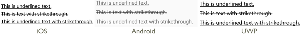
<Label Text="This is underlined text." TextDecorations="Underline"  />
<Label Text="This is text with strikethrough." TextDecorations="Strikethrough" />
<Label Text="This is underlined text with strikethrough." TextDecorations="Underline, Strikethrough" />
The equivalent C# code is:
var underlineLabel = new Label { Text = "This is underlined text.", TextDecorations = TextDecorations.Underline };
var strikethroughLabel = new Label { Text = "This is text with strikethrough.", TextDecorations = TextDecorations.Strikethrough };
var bothLabel = new Label { Text = "This is underlined text with strikethrough.", TextDecorations = TextDecorations.Underline | TextDecorations.Strikethrough };
The following screenshots show the TextDecorations enumeration members applied to Label instances:
Note
Text decorations can also be applied to Span instances. For more information about the Span class, see Formatted Text.
Transform text
A Label can transform the casing of its text, stored in the Text property, by setting the TextTransform property to a value of the TextTransform enumeration. This enumeration has four values:
Noneindicates that the text won't be transformed.Defaultindicates that the default behavior for the platform will be used. This is the default value of theTextTransformproperty.Lowercaseindicates that the text will be transformed to lowercase.Uppercaseindicates that the text will be transformed to uppercase.
The following example shows transforming text to uppercase:
<Label Text="This text will be displayed in uppercase."
       TextTransform="Uppercase" />
The equivalent C# code is:
Label label = new Label
{
    Text = "This text will be displayed in uppercase.",
    TextTransform = TextTransform.Uppercase
};
Character spacing
Character spacing can be applied to Label instances by setting the Label.CharacterSpacing property to a double value:
<Label Text="Character spaced text"
       CharacterSpacing="10" />
The equivalent C# code is:
Label label = new Label { Text = "Character spaced text", CharacterSpacing = 10 };
The result is that characters in the text displayed by the Label are spaced CharacterSpacing device-independent units apart.
New lines
There are two main techniques for forcing text in a Label onto a new line, from XAML:
- Use the unicode line feed character, which is " ".
- Specify your text using property element syntax.
The following code shows an example of both techniques:
<!-- Unicode line feed character -->
<Label Text="First line Second line" />
<!-- Property element syntax -->
<Label>
<Label.Text>
First line
Second line
</Label.Text>
</Label>
In C#, text can be forced onto a new line with the "\n" character:
Label label = new Label { Text = "First line\nSecond line" };
Colors
Labels can be set to use a custom text color via the bindable TextColor property.
Special care is necessary to ensure that colors will be usable on each platform. Because each platform has different defaults for text and background colors, you'll need to be careful to pick a default that works on each.
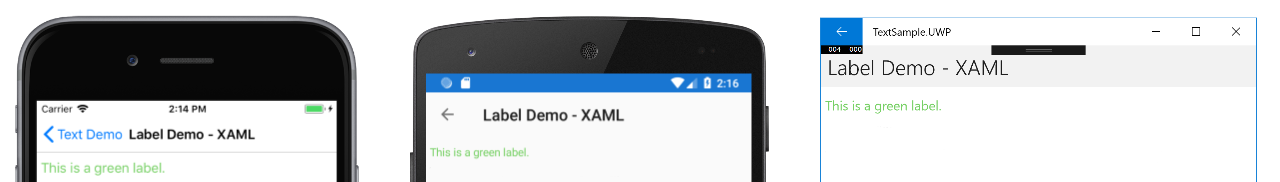
The following XAML example sets the text color of a Label:
<ContentPage xmlns="http://xamarin.com/schemas/2014/forms"
             xmlns:x="http://schemas.microsoft.com/winfx/2009/xaml"
             x:Class="TextSample.LabelPage"
             Title="Label Demo">
    <StackLayout Padding="5,10">
      <Label TextColor="#77d065" FontSize = "20" Text="This is a green label." />
    </StackLayout>
</ContentPage>
The equivalent C# code is:
public partial class LabelPage : ContentPage
{
    public LabelPage ()
    {
        InitializeComponent ();

        var layout = new StackLayout { Padding = new Thickness(5,10) };
        var label = new Label { Text="This is a green label.", TextColor = Color.FromHex("#77d065"), FontSize = 20 };
        layout.Children.Add(label);
        this.Content = layout;
    }
}
The following screenshots show the result of setting the TextColor property:
For more information about colors, see Colors.
Fonts
For more information about specifying fonts on a Label, see Fonts.
Truncation and wrapping
Labels can be set to handle text that can't fit on one line in one of several ways, exposed by the LineBreakMode property. LineBreakMode is an enumeration with the following values:
- HeadTruncation – truncates the head of the text, showing the end.
- CharacterWrap – wraps text onto a new line at a character boundary.
- MiddleTruncation – displays the beginning and end of the text, with the middle replace by an ellipsis.
- NoWrap – does not wrap text, displaying only as much text as can fit on one line.
- TailTruncation – shows the beginning of the text, truncating the end.
- WordWrap – wraps text at the word boundary.
Display a specific number of lines
The number of lines displayed by a Label can be specified by setting the Label.MaxLines property to a int value:
- When
MaxLinesis -1, which is its default value, theLabelrespects the value of theLineBreakModeproperty to either show just one line, possibly truncated, or all lines with all text. - When
MaxLinesis 0, theLabelisn't displayed. - When
MaxLinesis 1, the result is identical to setting theLineBreakModeproperty toNoWrap,HeadTruncation,MiddleTruncation, orTailTruncation. However, theLabelwill respect the value of theLineBreakModeproperty with regard to placement of an ellipsis, if applicable. - When
MaxLinesis greater than 1, theLabelwill display up to the specified number of lines, while respecting the value of theLineBreakModeproperty with regard to placement of an ellipsis, if applicable. However, setting theMaxLinesproperty to a value greater than 1 has no effect if theLineBreakModeproperty is set toNoWrap.
The following XAML example demonstrates setting the MaxLines property on a Label:
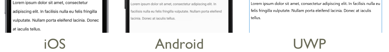
<Label Text="Lorem ipsum dolor sit amet, consectetur adipiscing elit. In facilisis nulla eu felis fringilla vulputate. Nullam porta eleifend lacinia. Donec at iaculis tellus."
       LineBreakMode="WordWrap"
       MaxLines="2" />
The equivalent C# code is:
var label =
{
  Text = "Lorem ipsum dolor sit amet, consectetur adipiscing elit. In facilisis nulla eu felis fringilla vulputate. Nullam porta eleifend lacinia. Donec at iaculis tellus.", LineBreakMode = LineBreakMode.WordWrap,
  MaxLines = 2
};
The following screenshots show the result of setting the MaxLines property to 2, when the text is long enough to occupy more than 2 lines:

Display HTML
The Label class has a TextType property, which determines whether the Label instance should display plain text, or HTML text. This property should be set to one of the members of the TextType enumeration:
Textindicates that theLabelwill display plain text, and is the default value of theLabel.TextTypeproperty.Htmlindicates that theLabelwill display HTML text.
Therefore, Label instances can display HTML by setting the Label.TextType property to Html, and the Label.Text property to a HTML string:
Label label = new Label
{
    Text = "This is <strong style=\"color:red\">HTML</strong> text.",
    TextType = TextType.Html
};
In the example above, the double quote characters in the HTML have to be escaped using the \ symbol.
In XAML, HTML strings can become unreadable due to additionally escaping the < and > symbols:
<Label Text="This is <strong style="color:red">HTML</strong> text."
TextType="Html" />
Alternatively, for greater readability the HTML can be inlined in a CDATA section:
<Label TextType="Html">
    <![CDATA[
    This is <strong style="color:red">HTML</strong> text.
    ]]>
</Label>
In this example, the Label.Text property is set to the HTML string that's inlined in the CDATA section. This works because the Text property is the ContentProperty for the Label class.
The following screenshots show a Label displaying HTML:

Important
Displaying HTML in a Label is limited to the HTML tags that are supported by the underlying platform.
Formatted text
Labels expose a FormattedText property that allows the presentation of text with multiple fonts and colors in the same view.
The FormattedText property is of type FormattedString, which comprises one or more Span instances, set via the Spans property. The following Span properties can be used to set visual appearance:
BackgroundColor– the color of the span background.CharacterSpacing, of typedouble, is the spacing between characters of theSpantext.Font– the font for the text in the span.FontAttributes– the font attributes for the text in the span.FontFamily– the font family to which the font for the text in the span belongs.FontSize– the size of the font for the text in the span.ForegroundColor– the color for the text in the span. This property is obsolete and has been replaced by theTextColorproperty.LineHeight- the multiplier to apply to the default line height of the span. For more information, see Line Height.Style– the style to apply to the span.Text– the text of the span.TextColor– the color for the text in the span.TextDecorations- the decorations to apply to the text in the span. For more information, see Text Decorations.
The BackgroundColor, Text, and Text bindable properties have a default binding mode of OneWay. For more information about this binding mode, see The Default Binding Mode in the Binding Mode guide.
In addition, the GestureRecognizers property can be used to define a collection of gesture recognizers that will respond to gestures on the Span.
Note
It's not possible to display HTML in a Span.
The following XAML example demonstrates a FormattedText property that consists of three Span instances:
<ContentPage xmlns="http://xamarin.com/schemas/2014/forms"
xmlns:x="http://schemas.microsoft.com/winfx/2009/xaml"
x:Class="TextSample.LabelPage"
Title="Label Demo - XAML">
<StackLayout Padding="5,10">
...
<Label LineBreakMode="WordWrap">
<Label.FormattedText>
<FormattedString>
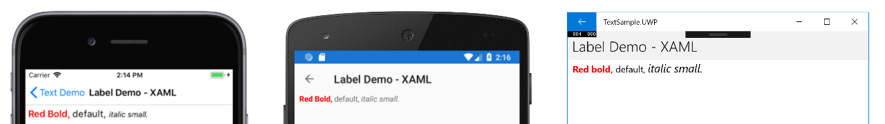
<Span Text="Red Bold, " TextColor="Red" FontAttributes="Bold" />
<Span Text="default, " Style="{DynamicResource BodyStyle}">
<Span.GestureRecognizers>
<TapGestureRecognizer Command="{Binding TapCommand}" />
</Span.GestureRecognizers>
</Span>
<Span Text="italic small." FontAttributes="Italic" FontSize="Small" />
</FormattedString>
</Label.FormattedText>
</Label>
</StackLayout>
</ContentPage>
The equivalent C# code is:
public class LabelPageCode : ContentPage
{
    public LabelPageCode ()
    {
        var layout = new StackLayout{ Padding = new Thickness (5, 10) };
        ...
        var formattedString = new FormattedString ();
        formattedString.Spans.Add (new Span{ Text = "Red bold, ", ForegroundColor = Color.Red, FontAttributes = FontAttributes.Bold });

        var span = new Span { Text = "default, " };
        span.GestureRecognizers.Add(new TapGestureRecognizer { Command = new Command(async () => await DisplayAlert("Tapped", "This is a tapped Span.", "OK")) });
        formattedString.Spans.Add(span);
        formattedString.Spans.Add (new Span { Text = "italic small.", FontAttributes = FontAttributes.Italic, FontSize =  Device.GetNamedSize(NamedSize.Small, typeof(Label)) });

        layout.Children.Add (new Label { FormattedText = formattedString });
        this.Content = layout;
    }
}
Important
The Text property of a Span can be set through data binding. For more information, see Data Binding.
Note that a Span can also respond to any gestures that are added to the span's GestureRecognizers collection. For example, a TapGestureRecognizer has been added to the second Span in the above code examples. Therefore, when this Span is tapped the TapGestureRecognizer will respond by executing the ICommand defined by the Command property. For more information about gesture recognizers, see Xamarin.Forms Gestures.
The following screenshots show the result of setting the FormattedString property to three Span instances:
Line height
The vertical height of a Label and a Span can be customized by setting the Label.LineHeight property or Span.LineHeight to a double value. On iOS and Android these values are multipliers of the original line height, and on the Universal Windows Platform (UWP) the Label.LineHeight property value is a multiplier of the label font size.
Note
- On iOS, the
Label.LineHeightandSpan.LineHeightproperties change the line height of text that fits on a single line, and text that wraps onto multiple lines. - On Android, the
Label.LineHeightandSpan.LineHeightproperties only change the line height of text that wraps onto multiple lines. - On UWP, the
Label.LineHeightproperty changes the line height of text that wraps onto multiple lines, and theSpan.LineHeightproperty has no effect.
The following XAML example demonstrates setting the LineHeight property on a Label:
<Label Text="Lorem ipsum dolor sit amet, consectetur adipiscing elit. In facilisis nulla eu felis fringilla vulputate. Nullam porta eleifend lacinia. Donec at iaculis tellus."
       LineBreakMode="WordWrap"
       LineHeight="1.8" />
The equivalent C# code is:
var label =
{
  Text = "Lorem ipsum dolor sit amet, consectetur adipiscing elit. In facilisis nulla eu felis fringilla vulputate. Nullam porta eleifend lacinia. Donec at iaculis tellus.", LineBreakMode = LineBreakMode.WordWrap,
  LineHeight = 1.8
};
The following screenshots show the result of setting the Label.LineHeight property to 1.8:
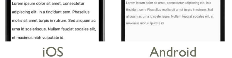
The following XAML example demonstrates setting the LineHeight property on a Span:
<Label LineBreakMode="WordWrap">
    <Label.FormattedText>
        <FormattedString>
            <Span Text="Lorem ipsum dolor sit amet, consectetur adipiscing elit. In a tincidunt sem. Phasellus mollis sit amet turpis in rutrum. Sed aliquam ac urna id scelerisque. "
                  LineHeight="1.8"/>
            <Span Text="Nullam feugiat sodales elit, et maximus nibh vulputate id."
                  LineHeight="1.8" />
        </FormattedString>
    </Label.FormattedText>
</Label>
The equivalent C# code is:
var formattedString = new FormattedString();
formattedString.Spans.Add(new Span
{
  Text = "Lorem ipsum dolor sit amet, consectetur adipiscing elit. In a tincidunt sem. Phasellus mollis sit amet turpis in rutrum. Sed aliquam ac urna id scelerisque. ",
  LineHeight = 1.8
});
formattedString.Spans.Add(new Span
{
  Text = "Nullam feugiat sodales elit, et maximus nibh vulputate id.",
  LineHeight = 1.8
});
var label = new Label
{
  FormattedText = formattedString,
  LineBreakMode = LineBreakMode.WordWrap
};
The following screenshots show the result of setting the Span.LineHeight property to 1.8:
Padding
Padding represents the space between an element and its child elements, and is used to separate the element from its own content. Padding can be applied to Label instances by setting the Label.Padding property to a Thickness value:
<Label Padding="10">
    <Label.FormattedText>
        <FormattedString>
            <Span Text="Lorem ipsum" />
            <Span Text="dolor sit amet." />
        </FormattedString>
    </Label.FormattedText>
</Label>
The equivalent C# code is:
FormattedString formattedString = new FormattedString();
formattedString.Spans.Add(new Span
{
  Text = "Lorem ipsum"
});
formattedString.Spans.Add(new Span
{
  Text = "dolor sit amet."
});
Label label = new Label
{
    FormattedText = formattedString,
    Padding = new Thickness(20)
};
Important
On iOS, when a Label is created that sets the Padding property, padding will be applied and the padding value can be updated later. However, when a Label is created that doesn't set the Padding property, attempting to set it later will have no effect.
On Android and the Universal Windows Platform, the Padding property value can be specified when the Label is created, or later.
For more information about padding, see Margins and Padding.
Hyperlinks
The text displayed by Label and Span instances can be turned into hyperlinks with the following approach:
- Set the
TextColorandTextDecorationproperties of theLabelorSpan. - Add a
TapGestureRecognizerto theGestureRecognizerscollection of theLabelorSpan, whoseCommandproperty binds to aICommand, and whoseCommandParameterproperty contains the URL to open. - Define the
ICommandthat will be executed by theTapGestureRecognizer. - Write the code that will be executed by the
ICommand.
The following code example shows a Label whose content is set from multiple Span instances:
<Label>
    <Label.FormattedText>
        <FormattedString>
            <Span Text="Alternatively, click " />
            <Span Text="here"
                  TextColor="Blue"
                  TextDecorations="Underline">
                <Span.GestureRecognizers>
                    <TapGestureRecognizer Command="{Binding TapCommand}"
                                          CommandParameter="https://free.blessedness.top/xamarin/" />
                </Span.GestureRecognizers>
            </Span>
            <Span Text=" to view Xamarin documentation." />
        </FormattedString>
    </Label.FormattedText>
</Label>
In this example, the first and third Span instances comprise text, while the second Span represents a tappable hyperlink. It has its text color set to blue, and has an underline text decoration. This creates the appearance of a hyperlink, as shown in the following screenshots:

When the hyperlink is tapped, the TapGestureRecognizer will respond by executing the ICommand defined by its Command property. In addition, the URL specified by the CommandParameter property will be passed to the ICommand as a parameter.
The code-behind for the XAML page contains the TapCommand implementation:
public partial class MainPage : ContentPage
{
    // Launcher.OpenAsync is provided by Xamarin.Essentials.
    public ICommand TapCommand => new Command<string>(async (url) => await Launcher.OpenAsync(url));

    public MainPage()
    {
        InitializeComponent();
        BindingContext = this;
    }
}
The TapCommand executes the Launcher.OpenAsync method, passing the TapGestureRecognizer.CommandParameter property value as a parameter. The Launcher.OpenAsync method is provided by Xamarin.Essentials, and opens the URL in a web browser. Therefore, the overall effect is that when the hyperlink is tapped on the page, a web browser appears and the URL associated with the hyperlink is navigated to.
Creating a reusable hyperlink class
The previous approach to creating a hyperlink requires writing repetitive code every time you require a hyperlink in your application. However, both the Label and Span classes can be subclassed to create HyperlinkLabel and HyperlinkSpan classes, with the gesture recognizer and text formatting code added there.
The following code example shows a HyperlinkSpan class:
public class HyperlinkSpan : Span
{
    public static readonly BindableProperty UrlProperty =
        BindableProperty.Create(nameof(Url), typeof(string), typeof(HyperlinkSpan), null);

    public string Url
    {
        get { return (string)GetValue(UrlProperty); }
        set { SetValue(UrlProperty, value); }
    }

    public HyperlinkSpan()
    {
        TextDecorations = TextDecorations.Underline;
        TextColor = Color.Blue;
        GestureRecognizers.Add(new TapGestureRecognizer
        {
            // Launcher.OpenAsync is provided by Xamarin.Essentials.
            Command = new Command(async () => await Launcher.OpenAsync(Url))
        });
    }
}
The HyperlinkSpan class defines a Url property, and associated BindableProperty, and the constructor sets the hyperlink appearance and the TapGestureRecognizer that will respond when the hyperlink is tapped. When a HyperlinkSpan is tapped, the TapGestureRecognizer will respond by executing the Launcher.OpenAsync method to open the URL, specified by the Url property, in a web browser.
The HyperlinkSpan class can be consumed by adding an instance of the class to the XAML:
<ContentPage xmlns="http://xamarin.com/schemas/2014/forms"
             xmlns:x="http://schemas.microsoft.com/winfx/2009/xaml"
             xmlns:local="clr-namespace:HyperlinkDemo"
             x:Class="HyperlinkDemo.MainPage">
    <StackLayout>
        ...
        <Label>
            <Label.FormattedText>
                <FormattedString>
                    <Span Text="Alternatively, click " />
                    <local:HyperlinkSpan Text="here"
                                         Url="https://free.blessedness.top/appcenter/" />
                    <Span Text=" to view AppCenter documentation." />
                </FormattedString>
            </Label.FormattedText>
        </Label>
    </StackLayout>
</ContentPage>
Styling labels
The previous sections covered setting Label and Span properties on a per-instance basis. However, sets of properties can be grouped into one style that is consistently applied to one or many views. This can increase readability of code and make design changes easier to implement. For more information, see Styles.