Note
Access to this page requires authorization. You can try signing in or changing directories.
Access to this page requires authorization. You can try changing directories.
The Xamarin.Forms ListView allows you to customize the presentation of the list, in addition to the ViewCell instances for each row in the list.
Grouping
Large sets of data can become unwieldy when presented in a continuously scrolling list. Enabling grouping can improve the user experience in these cases by better organizing the content and activating platform-specific controls that make navigating data easier.
When grouping is activated for a ListView, a header row is added for each group.
To enable grouping:
- Create a list of lists (a list of groups, each group being a list of elements).
- Set the
ListView'sItemsSourceto that list. - Set
IsGroupingEnabledto true. - Set
GroupDisplayBindingto bind to the property of the groups that is being used as the title of the group. - [Optional] Set
GroupShortNameBindingto bind to the property of the groups that is being used as the short name for the group. The short name is used for the jump lists (right-side column on iOS).
Start by creating a class for the groups:
public class PageTypeGroup : List<PageModel>
    {
        public string Title { get; set; }
        public string ShortName { get; set; } //will be used for jump lists
        public string Subtitle { get; set; }
        private PageTypeGroup(string title, string shortName)
        {
            Title = title;
            ShortName = shortName;
        }

        public static IList<PageTypeGroup> All { private set; get; }
    }
In the above code, All is the list that will be given to our ListView as the
binding source. Title and ShortName are the properties that will be used for group headings.
At this stage, All is an empty list. Add a static constructor so that the list
will be populated at program start:
static PageTypeGroup()
{
    List<PageTypeGroup> Groups = new List<PageTypeGroup> {
            new PageTypeGroup ("Alpha", "A"){
                new PageModel("Amelia", "Cedar", new switchCellPage(),""),
                new PageModel("Alfie", "Spruce", new switchCellPage(), "grapefruit.jpg"),
                new PageModel("Ava", "Pine", new switchCellPage(), "grapefruit.jpg"),
                new PageModel("Archie", "Maple", new switchCellPage(), "grapefruit.jpg")
            },
            new PageTypeGroup ("Bravo", "B"){
                new PageModel("Brooke", "Lumia", new switchCellPage(),""),
                new PageModel("Bobby", "Xperia", new switchCellPage(), "grapefruit.jpg"),
                new PageModel("Bella", "Desire", new switchCellPage(), "grapefruit.jpg"),
                new PageModel("Ben", "Chocolate", new switchCellPage(), "grapefruit.jpg")
            }
        };
        All = Groups; //set the publicly accessible list
}
In the above code, we can also call Add on elements of Groups,
which are instances of type PageTypeGroup. This method is possible because
PageTypeGroup inherits from List<PageModel>.
Here is the XAML for displaying the grouped list:
<?xml version="1.0" encoding="UTF-8"?>
<ContentPage xmlns="http://xamarin.com/schemas/2014/forms"
             xmlns:x="http://schemas.microsoft.com/winfx/2009/xaml"
             x:Class="DemoListView.GroupingViewPage"
    <ContentPage.Content>
        <ListView  x:Name="GroupedView"
                   GroupDisplayBinding="{Binding Title}"
                   GroupShortNameBinding="{Binding ShortName}"
                   IsGroupingEnabled="true">
            <ListView.ItemTemplate>
                <DataTemplate>
                    <TextCell Text="{Binding Title}"
                              Detail="{Binding Subtitle}" />
                </DataTemplate>
            </ListView.ItemTemplate>
        </ListView>
    </ContentPage.Content>
</ContentPage>
This XAML performs the following actions:
- Set
GroupShortNameBindingto theShortNameproperty defined in our group class - Set
GroupDisplayBindingto theTitleproperty defined in our group class - Set
IsGroupingEnabledto true - Changed the
ListView'sItemsSourceto the grouped list
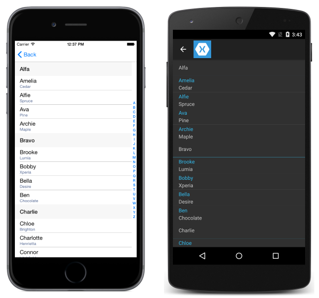
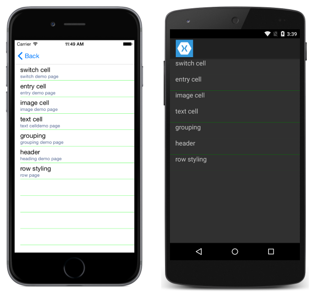
This following screenshot shows the resulting UI:
Customizing grouping
If grouping has been enabled in the list, the group header can also be customized.
Similar to how the ListView has an ItemTemplate for defining how rows are
displayed, ListView has a GroupHeaderTemplate.
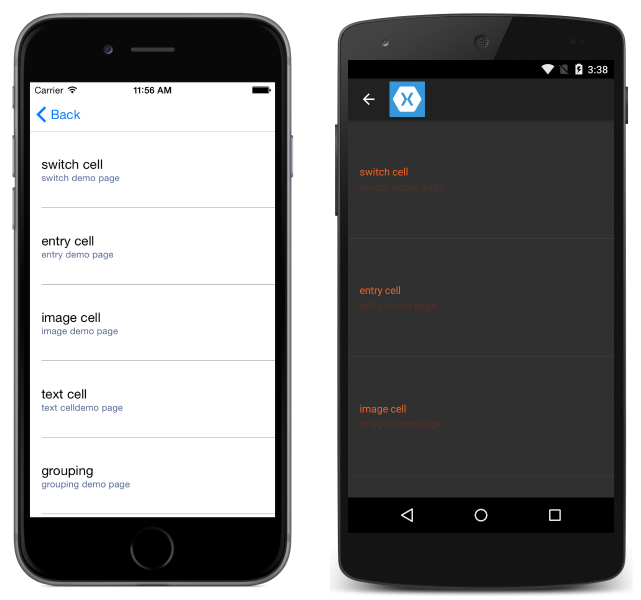
An example of customizing the group header in XAML is shown here:
<?xml version="1.0" encoding="UTF-8"?>
<ContentPage xmlns="http://xamarin.com/schemas/2014/forms"
             xmlns:x="http://schemas.microsoft.com/winfx/2009/xaml"
             x:Class="DemoListView.GroupingViewPage">
    <ContentPage.Content>
        <ListView x:Name="GroupedView"
                  GroupDisplayBinding="{Binding Title}"
                  GroupShortNameBinding="{Binding ShortName}"
                  IsGroupingEnabled="true">
            <ListView.ItemTemplate>
                <DataTemplate>
                    <TextCell Text="{Binding Title}"
                              Detail="{Binding Subtitle}"
                              TextColor="#f35e20"
                              DetailColor="#503026" />
                </DataTemplate>
            </ListView.ItemTemplate>
            <!-- Group Header Customization-->
            <ListView.GroupHeaderTemplate>
                <DataTemplate>
                    <TextCell Text="{Binding Title}"
                              Detail="{Binding ShortName}"
                              TextColor="#f35e20"
                              DetailColor="#503026" />
                </DataTemplate>
            </ListView.GroupHeaderTemplate>
            <!-- End Group Header Customization -->
        </ListView>
    </ContentPage.Content>
</ContentPage>
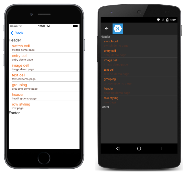
Headers and footers
It is possible for a ListView to present a header and footer that scroll with the elements of the list. The header and footer can be strings of text or a more complicated layout. This behavior is separate from section groups.
You can set the Header and/or Footer to a string value, or you can set them to a more complex layout. There are also HeaderTemplate and FooterTemplate properties that let you create more complex layouts for the header and footer that support data binding.
To create a basic header/footer, just set the Header or Footer properties to the text you want to display. In code:
ListView HeaderList = new ListView()
{
    Header = "Header",
    Footer = "Footer"
};
In XAML:
<ListView x:Name="HeaderList"
          Header="Header"
          Footer="Footer">
    ...
</ListView>
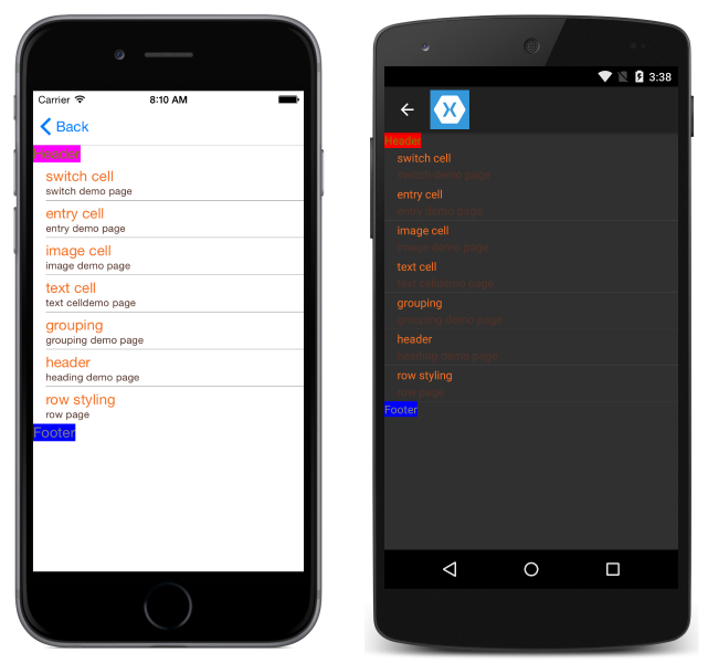
To create a customized header and footer, define the Header and Footer views:
<ListView.Header>
    <StackLayout Orientation="Horizontal">
        <Label Text="Header"
               TextColor="Olive"
               BackgroundColor="Red" />
    </StackLayout>
</ListView.Header>
<ListView.Footer>
    <StackLayout Orientation="Horizontal">
        <Label Text="Footer"
               TextColor="Gray"
               BackgroundColor="Blue" />
    </StackLayout>
</ListView.Footer>
Scrollbar visibility
The ListView class has HorizontalScrollBarVisibility and VerticalScrollBarVisibility properties, which get or set a ScrollBarVisibility value that represents when the horizontal, or vertical, scroll bar is visible. Both properties can be set to the following values:
Defaultindicates the default scroll bar behavior for the platform, and is the default value for theHorizontalScrollBarVisibilityandVerticalScrollBarVisibilityproperties.Alwaysindicates that scroll bars will be visible, even when the content fits in the view.Neverindicates that scroll bars will not be visible, even if the content doesn't fit in the view.
Row separators
Separator lines are displayed between ListView elements by default on iOS and Android. If you'd prefer to hide the separator lines on iOS and Android, set the SeparatorVisibility property on your ListView. The options for SeparatorVisibility are:
- Default - shows a separator line on iOS and Android.
- None - hides the separator on all platforms.
Default Visibility:
C#:
SeparatorDemoListView.SeparatorVisibility = SeparatorVisibility.Default;
XAML:
<ListView x:Name="SeparatorDemoListView" SeparatorVisibility="Default" />

None:
C#:
SeparatorDemoListView.SeparatorVisibility = SeparatorVisibility.None;
XAML:
<ListView x:Name="SeparatorDemoListView" SeparatorVisibility="None" />
You can also set the color of the separator line via the SeparatorColor property:
C#:
SeparatorDemoListView.SeparatorColor = Color.Green;
XAML:
<ListView x:Name="SeparatorDemoListView" SeparatorColor="Green" />
Note
Setting either of these properties on Android after loading the ListView incurs a large performance penalty.
Row height
All rows in a ListView have the same height by default. ListView has two properties that can be used to change that behavior:
HasUnevenRows–true/falsevalue, rows have varying heights if set totrue. Defaults tofalse.RowHeight– sets the height of each row whenHasUnevenRowsisfalse.
You can set the height of all rows by setting the RowHeight property on the ListView.
Custom fixed row height
C#:
RowHeightDemoListView.RowHeight = 100;
XAML:
<ListView x:Name="RowHeightDemoListView" RowHeight="100" />
Uneven rows
If you'd like individual rows to have different heights, you can set the HasUnevenRows property to true. Row heights don't have to be manually set once HasUnevenRows has been set to true, because the heights will be automatically calculated by Xamarin.Forms.
C#:
RowHeightDemoListView.HasUnevenRows = true;
XAML:
<ListView x:Name="RowHeightDemoListView" HasUnevenRows="true" />
Resize rows at runtime
Individual ListView rows can be programmatically resized at runtime, provided that the HasUnevenRows property is set to true. The Cell.ForceUpdateSize method updates a cell's size, even when it isn't currently visible, as demonstrated in the following code example:
void OnImageTapped (object sender, EventArgs args)
{
    var image = sender as Image;
    var viewCell = image.Parent.Parent as ViewCell;

    if (image.HeightRequest < 250) {
        image.HeightRequest = image.Height + 100;
        viewCell.ForceUpdateSize ();
    }
}
The OnImageTapped event handler is executed in response to an Image in a cell being tapped, and increases the size of the Image displayed in the cell so that it's easily viewed.

Warning
Overuse of runtime row resizing can cause performance degradation.