Note
Access to this page requires authorization. You can try signing in or changing directories.
Access to this page requires authorization. You can try changing directories.
Triggers allow you to express actions declaratively in XAML that change the appearance of controls based on events or property changes. In addition, state triggers, which are a specialized group of triggers, define when a VisualState should be applied.
You can assign a trigger directly to a control, or add it to a page-level or app-level resource dictionary to be applied to multiple controls.
Property triggers
A simple trigger can be expressed purely in XAML, adding
a Trigger element to a control's triggers collection.
This example shows a trigger that changes an Entry
background color when it receives focus:
<Entry Placeholder="enter name">
    <Entry.Triggers>
        <Trigger TargetType="Entry"
                 Property="IsFocused" Value="True">
            <Setter Property="BackgroundColor" Value="Yellow" />
            <!-- multiple Setters elements are allowed -->
        </Trigger>
    </Entry.Triggers>
</Entry>
The important parts of the trigger's declaration are:
TargetType - the control type that the trigger applies to.
Property - the property on the control that is monitored.
Value - the value, when it occurs for the monitored property, that causes the trigger to activate.
Setter - a collection of
Setterelements can be added and when the trigger condition is met. You must specify thePropertyandValueto set.EnterActions and ExitActions (not shown) - are written in code and can be used in addition to (or instead of)
Setterelements. They are described below.
Applying a trigger using a style
Triggers can also be added to a Style declaration
on a control, in a page, or an application ResourceDictionary. This
example declares an implicit style (i.e. no Key is
set) which means it will apply to all Entry controls
on the page.
<ContentPage.Resources>
    <ResourceDictionary>
        <Style TargetType="Entry">
                        <Style.Triggers>
                <Trigger TargetType="Entry"
                         Property="IsFocused" Value="True">
                    <Setter Property="BackgroundColor" Value="Yellow" />
                    <!-- multiple Setters elements are allowed -->
                </Trigger>
            </Style.Triggers>
        </Style>
    </ResourceDictionary>
</ContentPage.Resources>
Data triggers
Data triggers use data binding to monitor another control
to cause the Setters to get called. Instead of
the Property attribute in a property trigger, set the
Binding attribute to monitor for the
specified value.
The example below uses the data binding syntax
{Binding Source={x:Reference entry}, Path=Text.Length}
which is how we refer to another control's properties. When the
length of the entry is zero, the trigger is activated. In this
sample the trigger disables the button when the input is empty.
<!-- the x:Name is referenced below in DataTrigger-->
<!-- tip: make sure to set the Text="" (or some other default) -->
<Entry x:Name="entry"
       Text=""
       Placeholder="required field" />

<Button x:Name="button" Text="Save"
        FontSize="Large"
        HorizontalOptions="Center">
    <Button.Triggers>
        <DataTrigger TargetType="Button"
                     Binding="{Binding Source={x:Reference entry},
                                       Path=Text.Length}"
                     Value="0">
            <Setter Property="IsEnabled" Value="False" />
            <!-- multiple Setters elements are allowed -->
        </DataTrigger>
    </Button.Triggers>
</Button>
Tip
When evaluating Path=Text.Length always provide a
default value for the target property (eg. Text="")
because otherwise it will be null and the trigger
won't work like you expect.
In addition to specifying Setters you can also provide
EnterActions and ExitActions.
Event triggers
The EventTrigger element
requires only an Event property, such as "Clicked"
in the example below.
<EventTrigger Event="Clicked">
    <local:NumericValidationTriggerAction />
</EventTrigger>
Notice that there are no Setter elements but rather
a reference to a class defined by local:NumericValidationTriggerAction
which requires the xmlns:local to be declared in
the page's XAML:
<ContentPage xmlns="http://xamarin.com/schemas/2014/forms"
             xmlns:x="http://schemas.microsoft.com/winfx/2009/xaml"
             xmlns:local="clr-namespace:WorkingWithTriggers;assembly=WorkingWithTriggers"
The class itself implements TriggerAction which means it should
provide an override for the Invoke method that is called
whenever the trigger event occurs.
A trigger action implementation should:
Implement the generic
TriggerAction<T>class, with the generic parameter corresponding with the type of control the trigger will be applied to. You can use superclasses such asVisualElementto write trigger actions that work with a variety of controls, or specify a control type likeEntry.Override the
Invokemethod - this is called whenever the trigger criteria are met.Optionally expose properties that can be set in the XAML when the trigger is declared. For an example of this, see the
VisualElementPopTriggerActionclass in the accompanying sample application.
public class NumericValidationTriggerAction : TriggerAction<Entry>
{
    protected override void Invoke (Entry entry)
    {
        double result;
        bool isValid = Double.TryParse (entry.Text, out result);
        entry.TextColor = isValid ? Color.Default : Color.Red;
    }
}
The event trigger can then be consumed from XAML:
<EventTrigger Event="TextChanged">
    <local:NumericValidationTriggerAction />
</EventTrigger>
Be careful when sharing triggers in a ResourceDictionary,
one instance will be shared among controls so any state
that is configured once will apply to them all.
Note that event triggers do not support EnterActions
and ExitActions described below.
Multi triggers
A MultiTrigger looks similar to a Trigger or DataTrigger
except there can be more than one condition. All the conditions
must be true before the Setters are triggered.
Here's an example of a trigger for a button that binds to
two different inputs (email and phone):
<MultiTrigger TargetType="Button">
    <MultiTrigger.Conditions>
        <BindingCondition Binding="{Binding Source={x:Reference email},
                                   Path=Text.Length}"
                               Value="0" />
        <BindingCondition Binding="{Binding Source={x:Reference phone},
                                   Path=Text.Length}"
                               Value="0" />
    </MultiTrigger.Conditions>
    <Setter Property="IsEnabled" Value="False" />
    <!-- multiple Setter elements are allowed -->
</MultiTrigger>
The Conditions collection could also contain
PropertyCondition elements like this:
<PropertyCondition Property="Text" Value="OK" />
Building a "require all" multi trigger
The multi trigger only updates its control when all conditions are true. Testing for "all field lengths are zero" (such as a login page where all inputs must be complete) is tricky because you want a condition "where Text.Length > 0" but this can't be expressed in XAML.
This can be done with an IValueConverter. The converter
code below transforms the Text.Length binding into a
bool that indicates whether a field is empty or not:
public class MultiTriggerConverter : IValueConverter
{
    public object Convert(object value, Type targetType,
        object parameter, CultureInfo culture)
    {
        if ((int)value > 0) // length > 0 ?
            return true;            // some data has been entered
        else
            return false;            // input is empty
    }

    public object ConvertBack(object value, Type targetType,
        object parameter, CultureInfo culture)
    {
        throw new NotSupportedException ();
    }
}
To use this converter in a multi trigger, first add it
to the page's resource dictionary (along with a custom
xmlns:local namespace definition):
<ResourceDictionary>
   <local:MultiTriggerConverter x:Key="dataHasBeenEntered" />
</ResourceDictionary>
The XAML is shown below. Note the following differences from the first multi trigger example:
- The button has
IsEnabled="false"set by default. - The multi trigger conditions use the converter to
turn the
Text.Lengthvalue into aboolean. - When all the conditions are
true, the setter makes the button'sIsEnabledpropertytrue.
<Entry x:Name="user" Text="" Placeholder="user name" />

<Entry x:Name="pwd" Text="" Placeholder="password" />

<Button x:Name="loginButton" Text="Login"
        FontSize="Large"
        HorizontalOptions="Center"
        IsEnabled="false">
  <Button.Triggers>
    <MultiTrigger TargetType="Button">
      <MultiTrigger.Conditions>
        <BindingCondition Binding="{Binding Source={x:Reference user},
                              Path=Text.Length,
                              Converter={StaticResource dataHasBeenEntered}}"
                          Value="true" />
        <BindingCondition Binding="{Binding Source={x:Reference pwd},
                              Path=Text.Length,
                              Converter={StaticResource dataHasBeenEntered}}"
                          Value="true" />
      </MultiTrigger.Conditions>
      <Setter Property="IsEnabled" Value="True" />
    </MultiTrigger>
  </Button.Triggers>
</Button>
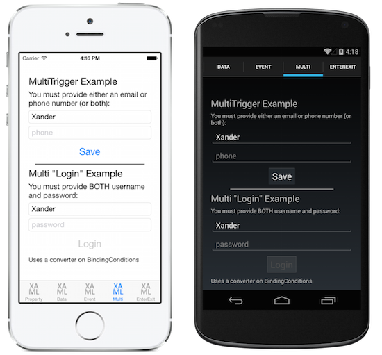
These screenshots show the difference between the two multi
trigger examples above. In the top part of the screens, text input in
just one Entry is enough to enable the Save button.
In the bottom part of the screens, the Login button
remains inactive until both fields contain data.
EnterActions and ExitActions
Another way to implement changes when a trigger occurs is by adding EnterActions and ExitActions collections and specifying TriggerAction<T> implementations.
The EnterActions collection is used to define an IList of TriggerAction objects that will be invoked when the trigger condition is met. The ExitActions collection is used to define an IList of TriggerAction objects that will be invoked after the trigger condition is no longer met.
Note
The TriggerAction objects defined in the EnterActions and ExitActions collections are ignored by the EventTrigger class.
You can provide both EnterActions and ExitActions as well as Setters in a trigger, but be aware that the Setters are called immediately (they do not wait for the EnterAction or ExitAction to complete). Alternatively you can perform everything in the code and not use Setters at all.
<Entry Placeholder="enter job title">
    <Entry.Triggers>
        <Trigger TargetType="Entry"
                 Property="Entry.IsFocused" Value="True">
            <Trigger.EnterActions>
                <local:FadeTriggerAction StartsFrom="0" />
            </Trigger.EnterActions>

            <Trigger.ExitActions>
                <local:FadeTriggerAction StartsFrom="1" />
            </Trigger.ExitActions>
            <!-- You can use both Enter/Exit and Setter together if required -->
        </Trigger>
    </Entry.Triggers>
</Entry>
As always, when a class is referenced in XAML you should declare a namespace such as xmlns:local as shown here:
<ContentPage xmlns="http://xamarin.com/schemas/2014/forms"
             xmlns:x="http://schemas.microsoft.com/winfx/2009/xaml"
             xmlns:local="clr-namespace:WorkingWithTriggers;assembly=WorkingWithTriggers"
The FadeTriggerAction code is shown below:
public class FadeTriggerAction : TriggerAction<VisualElement>
{
    public int StartsFrom { set; get; }

    protected override void Invoke(VisualElement sender)
    {
        sender.Animate("FadeTriggerAction", new Animation((d) =>
        {
            var val = StartsFrom == 1 ? d : 1 - d;
            // so i was aiming for a different color, but then i liked the pink :)
            sender.BackgroundColor = Color.FromRgb(1, val, 1);
        }),
        length: 1000, // milliseconds
        easing: Easing.Linear);
    }
}
State triggers
State triggers are a specialized group of triggers that define the conditions under which a VisualState should be applied.
State triggers are added to the StateTriggers collection of a VisualState. This collection can contain a single state trigger, or multiple state triggers. A VisualState will be applied when any state triggers in the collection are active.
When using state triggers to control visual states, Xamarin.Forms uses the following precedence rules to determine which trigger (and corresponding VisualState) will be active:
- Any trigger that derives from
StateTriggerBase. - An
AdaptiveTriggeractivated due to theMinWindowWidthcondition being met. - An
AdaptiveTriggeractivated due to theMinWindowHeightcondition being met.
If multiple triggers are simultaneously active (for example, two custom triggers) then the first trigger declared in the markup takes precedence.
Note
State triggers can be set in a Style, or directly on elements.
For more information about visual states, see Xamarin.Forms Visual State Manager.
State trigger
The StateTrigger class, which derives from the StateTriggerBase class, has an IsActive bindable property. A StateTrigger triggers a VisualState change when the IsActive property changes value.
The StateTriggerBase class, which is the base class for all state triggers, has an IsActive property and an IsActiveChanged event. This event fires whenever a VisualState change occurs. In addition, the StateTriggerBase class has overridable OnAttached and OnDetached methods.
Important
The StateTrigger.IsActive bindable property hides the inherited StateTriggerBase.IsActive property.
The following XAML example shows a Style that includes StateTrigger objects:
<Style TargetType="Grid">
    <Setter Property="VisualStateManager.VisualStateGroups">
        <VisualStateGroupList>
            <VisualStateGroup>
                <VisualState x:Name="Checked">
                    <VisualState.StateTriggers>
                        <StateTrigger IsActive="{Binding IsToggled}"
                                      IsActiveChanged="OnCheckedStateIsActiveChanged" />
                    </VisualState.StateTriggers>
                    <VisualState.Setters>
                        <Setter Property="BackgroundColor"
                                Value="Black" />
                    </VisualState.Setters>
                </VisualState>
                <VisualState x:Name="Unchecked">
                    <VisualState.StateTriggers>
                        <StateTrigger IsActive="{Binding IsToggled, Converter={StaticResource inverseBooleanConverter}}"
                                      IsActiveChanged="OnUncheckedStateIsActiveChanged" />
                    </VisualState.StateTriggers>
                    <VisualState.Setters>
                        <Setter Property="BackgroundColor"
                                Value="White" />
                    </VisualState.Setters>
                </VisualState>
            </VisualStateGroup>
        </VisualStateGroupList>
    </Setter>
</Style>
In this example, the implicit Style targets Grid objects. When the IsToggled property of the bound object is true, the background color of the Grid is set to black. When the IsToggled property of the bound object becomes false, a VisualState change is triggered, and the background color of the Grid becomes white.
In addition, every time a VisualState change occurs, the IsActiveChanged event for the VisualState is fired. Each VisualState registers an event handler for this event:
void OnCheckedStateIsActiveChanged(object sender, EventArgs e)
{
    StateTriggerBase stateTrigger = sender as StateTriggerBase;
    Console.WriteLine($"Checked state active: {stateTrigger.IsActive}");
}

void OnUncheckedStateIsActiveChanged(object sender, EventArgs e)
{
    StateTriggerBase stateTrigger = sender as StateTriggerBase;
    Console.WriteLine($"Unchecked state active: {stateTrigger.IsActive}");
}
In this example, when a handler for the IsActiveChanged event is fired, the handler outputs whether the VisualState is active or not. For example, the following messages are output to the console window when changing from the Checked visual state to the Unchecked visual state:
Checked state active: False
Unchecked state active: True
Note
Custom state triggers can be created by deriving from the StateTriggerBase class, and overriding the OnAttached and OnDetached methods to perform any required registrations and cleanup.
Adaptive trigger
An AdaptiveTrigger triggers a VisualState change when the window is a specified height or width. This trigger has two bindable properties:
MinWindowHeight, of typedouble, which indicates the minimum window height at which theVisualStateshould be applied.MinWindowWidth, of typedouble, which indicates the minimum window width at which theVisualStateshould be applied.
Note
The AdaptiveTrigger derives from the StateTriggerBase class and can therefore attach an event handler to the IsActiveChanged event.
The following XAML example shows a Style that includes AdaptiveTrigger objects:
<Style TargetType="StackLayout">
    <Setter Property="VisualStateManager.VisualStateGroups">
        <VisualStateGroupList>
            <VisualStateGroup>
                <VisualState x:Name="Vertical">
                    <VisualState.StateTriggers>
                        <AdaptiveTrigger MinWindowWidth="0" />
                    </VisualState.StateTriggers>
                    <VisualState.Setters>
                        <Setter Property="Orientation"
                                Value="Vertical" />
                    </VisualState.Setters>
                </VisualState>
                <VisualState x:Name="Horizontal">
                    <VisualState.StateTriggers>
                        <AdaptiveTrigger MinWindowWidth="800" />
                    </VisualState.StateTriggers>
                    <VisualState.Setters>
                        <Setter Property="Orientation"
                                Value="Horizontal" />
                    </VisualState.Setters>
                </VisualState>
            </VisualStateGroup>
        </VisualStateGroupList>
    </Setter>
</Style>
In this example, the implicit Style targets StackLayout objects. When the window width is between 0 and 800 device-independent units, StackLayout objects to which the Style is applied will have a vertical orientation. When the window width is >= 800 device-independent units, the VisualState change is triggered, and the StackLayout orientation changes to horizontal:


The MinWindowHeight and MinWindowWidth properties can be used independently or in conjunction with each other. The following XAML shows an example of setting both properties:
<AdaptiveTrigger MinWindowWidth="800"
                 MinWindowHeight="1200"/>
In this example, the AdaptiveTrigger indicates that the corresponding VisualState will be applied when the current window width is >= 800 device-independent units and the current window height is >= 1200 device-independent units.
Compare state trigger
The CompareStateTrigger triggers a VisualState change when a property is equal to a specific value. This trigger has two bindable properties:
Property, of typeobject, which indicates the property being compared by the trigger.Value, of typeobject, which indicates the value at which theVisualStateshould be applied.
Note
The CompareStateTrigger derives from the StateTriggerBase class and can therefore attach an event handler to the IsActiveChanged event.
The following XAML example shows a Style that includes CompareStateTrigger objects:
<Style TargetType="Grid">
    <Setter Property="VisualStateManager.VisualStateGroups">
        <VisualStateGroupList>
            <VisualStateGroup>
                <VisualState x:Name="Checked">
                    <VisualState.StateTriggers>
                        <CompareStateTrigger Property="{Binding Source={x:Reference checkBox}, Path=IsChecked}"
                                             Value="True" />
                    </VisualState.StateTriggers>
                    <VisualState.Setters>
                        <Setter Property="BackgroundColor"
                                Value="Black" />
                    </VisualState.Setters>
                </VisualState>
                <VisualState x:Name="Unchecked">
                    <VisualState.StateTriggers>
                        <CompareStateTrigger Property="{Binding Source={x:Reference checkBox}, Path=IsChecked}"
                                             Value="False" />
                    </VisualState.StateTriggers>
                    <VisualState.Setters>
                        <Setter Property="BackgroundColor"
                                Value="White" />
                    </VisualState.Setters>
                </VisualState>
            </VisualStateGroup>
        </VisualStateGroupList>
    </Setter>
</Style>
...
<Grid>
    <Frame BackgroundColor="White"
           CornerRadius="12"
           Margin="24"
           HorizontalOptions="Center"
           VerticalOptions="Center">
        <StackLayout Orientation="Horizontal">
            <CheckBox x:Name="checkBox"
                      VerticalOptions="Center" />
            <Label Text="Check the CheckBox to modify the Grid background color."
                   VerticalOptions="Center" />
        </StackLayout>
    </Frame>
</Grid>
In this example, the implicit Style targets Grid objects. When the IsChecked property of the CheckBox is false, the background color of the Grid is set to white. When the CheckBox.IsChecked property becomes true, a VisualState change is triggered, and the background color of the Grid becomes black:


Device state trigger
The DeviceStateTrigger triggers a VisualState change based on the device platform the app is running on. This trigger has a single bindable property:
Device, of typestring, which indicates the device platform on which theVisualStateshould be applied.
Note
The DeviceStateTrigger derives from the StateTriggerBase class and can therefore attach an event handler to the IsActiveChanged event.
The following XAML example shows a Style that includes DeviceStateTrigger objects:
<Style x:Key="DeviceStateTriggerPageStyle"
       TargetType="ContentPage">
    <Setter Property="VisualStateManager.VisualStateGroups">
        <VisualStateGroupList>
            <VisualStateGroup>
                <VisualState x:Name="iOS">
                    <VisualState.StateTriggers>
                        <DeviceStateTrigger Device="iOS" />
                    </VisualState.StateTriggers>
                    <VisualState.Setters>
                        <Setter Property="BackgroundColor"
                                Value="Silver" />
                    </VisualState.Setters>
                </VisualState>
                <VisualState x:Name="Android">
                    <VisualState.StateTriggers>
                        <DeviceStateTrigger Device="Android" />
                    </VisualState.StateTriggers>
                    <VisualState.Setters>
                        <Setter Property="BackgroundColor"
                                Value="#2196F3" />
                    </VisualState.Setters>
                </VisualState>
                <VisualState x:Name="UWP">
                    <VisualState.StateTriggers>
                        <DeviceStateTrigger Device="UWP" />
                    </VisualState.StateTriggers>
                    <VisualState.Setters>
                        <Setter Property="BackgroundColor"
                                Value="Aquamarine" />
                    </VisualState.Setters>
                </VisualState>
            </VisualStateGroup>
        </VisualStateGroupList>
    </Setter>
</Style>
In this example, the explicit Style targets ContentPage objects. ContentPage objects that consume the style set their background color to silver on iOS, to pale blue on Android, and to aquamarine on UWP. The following screenshots show the resulting pages on iOS and Android:

Orientation state trigger
The OrientationStateTrigger triggers a VisualState change when the orientation of the device changes. This trigger has a single bindable property:
Orientation, of typeDeviceOrientation, which indicates the orientation to which theVisualStateshould be applied.
Note
The OrientationStateTrigger derives from the StateTriggerBase class and can therefore attach an event handler to the IsActiveChanged event.
The following XAML example shows a Style that includes OrientationStateTrigger objects:
<Style x:Key="OrientationStateTriggerPageStyle"
       TargetType="ContentPage">
    <Setter Property="VisualStateManager.VisualStateGroups">
        <VisualStateGroupList>
            <VisualStateGroup>
                <VisualState x:Name="Portrait">
                    <VisualState.StateTriggers>
                        <OrientationStateTrigger Orientation="Portrait" />
                    </VisualState.StateTriggers>
                    <VisualState.Setters>
                        <Setter Property="BackgroundColor"
                                Value="Silver" />
                    </VisualState.Setters>
                </VisualState>
                <VisualState x:Name="Landscape">
                    <VisualState.StateTriggers>
                        <OrientationStateTrigger Orientation="Landscape" />
                    </VisualState.StateTriggers>
                    <VisualState.Setters>
                        <Setter Property="BackgroundColor"
                                Value="White" />
                    </VisualState.Setters>
                </VisualState>
            </VisualStateGroup>
        </VisualStateGroupList>
    </Setter>
</Style>
In this example, the explicit Style targets ContentPage objects. ContentPage objects that consume the style set their background color to silver when the orientation is portrait, and set their background color to white when the orientation is landscape.