Note
Access to this page requires authorization. You can try signing in or changing directories.
Access to this page requires authorization. You can try changing directories.
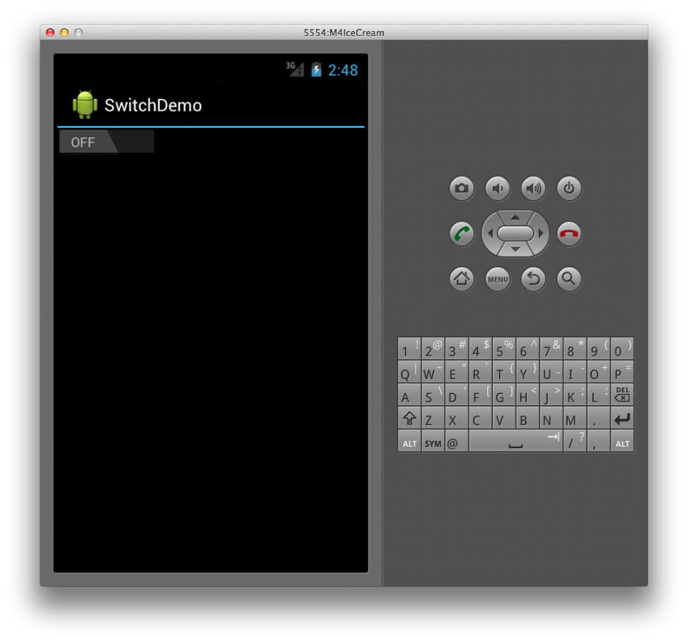
The Switch widget (shown below) allows a user
to toggle between two states, such as ON or OFF. The Switch default
value is OFF. The widget is shown below in both its ON and OFF states:
Creating a Switch
To create a switch, simply declare a Switch element in XML as
follows:
<Switch android:layout_width="wrap_content"
        android:layout_height="wrap_content" />
This creates a basic switch as shown below:
Changing Default Values
Both the text that the control displays for the ON and OFF states and
the default value are configurable. For example, to make the Switch
default to ON and read NO/YES instead of OFF/ON, we can set the
checked, textOn, and textOff attributes in the following XML.
<Switch android:layout_width="wrap_content"
        android:layout_height="wrap_content"
        android:checked="true"
        android:textOn="YES"
        android:textOff="NO" />
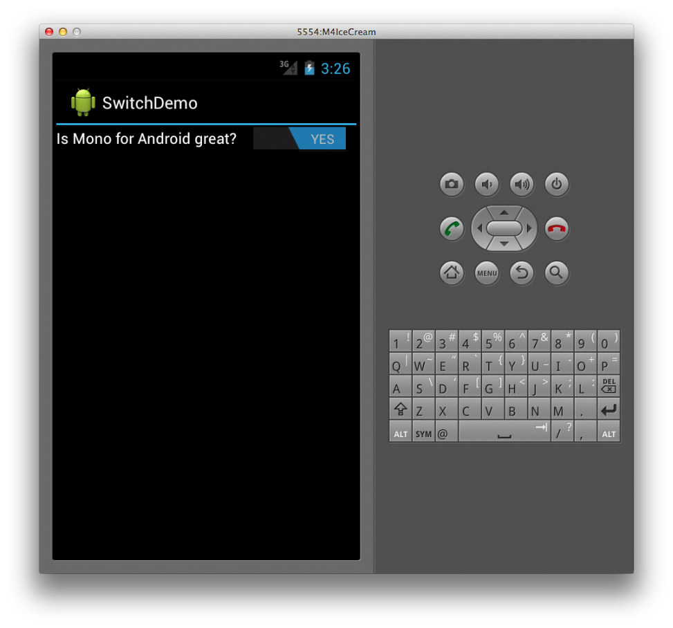
Providing a Title
The Switch widget also supports including a text label by setting the
text attribute as follows:
<Switch android:text="Is Xamarin.Android great?"
        android:layout_width="wrap_content"
        android:layout_height="wrap_content"
        android:checked="true"
        android:textOn="YES"
        android:textOff="NO" />
This markup produces the following screenshot at runtime:
When a Switch's value changes, it raises a CheckedChange event.
For example, in the following code we capture this event and present a
Toast widget with a message based upon the isChecked value of
Switch, which is passed to the event handler as part of the
CompoundButton.CheckedChangeEventArg argument.
Switch s = FindViewById<Switch> (Resource.Id.monitored_switch);

s.CheckedChange += delegate(object sender, CompoundButton.CheckedChangeEventArgs e) {
    var toast = Toast.MakeText (this, "Your answer is " +
        (e.IsChecked ?  "correct" : "incorrect"), ToastLength.Short);
    toast.Show ();
};


