Note
Access to this page requires authorization. You can try signing in or changing directories.
Access to this page requires authorization. You can try changing directories.
The Cardview widget is a UI component that presents text and image content in views that resemble cards. This guide explains how to use and customize CardView in Xamarin.Android applications while maintaining backward compatibility with earlier versions of Android.
Overview
The Cardview widget, introduced in Android 5.0 (Lollipop), is a UI
component that presents text and image content in views that resemble
cards. CardView is implemented as a FrameLayout widget with rounded
corners and a shadow. Typically, a CardView is used to present a
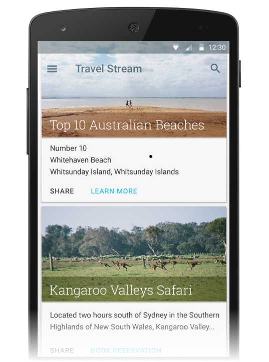
single row item in a ListView or GridView view group. For example,
the following screen shot is an example of a travel reservation app
that implements CardView-based travel destination cards in a
scrollable ListView:
This guide explains how to add the CardView package to your
Xamarin.Android project, how to add CardView to your layout, and how
to customize the appearance of CardView in your app. In addition,
this guide provides a detailed list of CardView attributes that you
can change, including attributes to help you use CardView on versions
of Android earlier than Android 5.0 Lollipop.
Requirements
The following is required to use new Android 5.0 and later features
(including CardView) in Xamarin-based apps:
Xamarin.Android – Xamarin.Android 4.20 or later must be installed and configured with either Visual Studio or Visual Studio for Mac.
Android SDK – Android 5.0 (API 21) or later must be installed via the Android SDK Manager.
Java JDK 1.8 – JDK 1.7 can be used if you are specifically targeting API level 23 and earlier. JDK 1.8 is available from Oracle.
Your app must also include the Xamarin.Android.Support.v7.CardView
package. To add the Xamarin.Android.Support.v7.CardView package in
Visual Studio for Mac:
Open your project, right-click Packages and select Add Packages.
In the Add Packages dialog, search for CardView.
Select Xamarin Support Library v7 CardView, then click Add Package.
To add the Xamarin.Android.Support.v7.CardView package in Visual
Studio:
Open your project, right-click the References node (in the Solution Explorer pane) and select Manage NuGet Packages....
When the Manage NuGet Packages dialog is displayed, enter CardView in the search box.
When Xamarin Support Library v7 CardView appears, click Install.
To learn how to configure an Android 5.0 app project, see Setting Up an Android 5.0 Project. For more information about installing NuGet packages, see Walkthrough: Including a NuGet in your project.
Introducing CardView
The default CardView resembles a white card with minimally rounded
corners and a slight shadow. The following example Main.axml layout
displays a single CardView widget that contains a TextView:
<?xml version="1.0" encoding="utf-8"?>
<LinearLayout xmlns:android="http://schemas.android.com/apk/res/android"
    android:orientation="vertical"
    android:layout_width="fill_parent"
    android:layout_height="fill_parent"
    android:gravity="center_horizontal"
    android:padding="5dp">
    <android.support.v7.widget.CardView
        android:layout_width="fill_parent"
        android:layout_height="245dp"
        android:layout_gravity="center_horizontal">
        <TextView
            android:text="Basic CardView"
            android:layout_marginTop="0dp"
            android:layout_width="match_parent"
            android:layout_height="match_parent"
            android:gravity="center"
            android:layout_centerVertical="true"
            android:layout_alignParentRight="true"
            android:layout_alignParentEnd="true" />
    </android.support.v7.widget.CardView>
</LinearLayout>
If you use this XML to replace the existing contents of Main.axml, be sure to comment out any code in MainActivity.cs that refers to resources in the previous XML.
This layout example creates a default CardView with a single line of
text as shown in the following screen shot:

In this example, the app style is set to the light Material Theme
(Theme.Material.Light) so that the CardView shadows and edges are
easier to see. For more information about theming Android 5.0 apps, see
Material Theme. In
the next section, we'll learn how to customize CardView for an
application.
Customizing CardView
You can modify the basic CardView attributes to customize the
appearance of the CardView in your app. For example, the elevation of
the CardView can be increased to cast a larger shadow (which makes
the card seem to float higher above the background). Also, the corner
radius can be increased to make the corners of the card more rounded.
In the next layout example, a customized CardView is used to create a
simulation of a print photograph (a "snapshot"). An ImageView is
added to the CardView for displaying the image, and a TextView is
positioned below the ImageView for displaying the title of the image.
In this example layout, the CardView has the following
customizations:
- The
cardElevationis increased to 4dp to cast a larger shadow. - The
cardCornerRadiusis increased to 5dp to make the corners appear more rounded.
Because CardView is provided by the Android v7 support library, its
attributes are not available from the android: namespace. Therefore,
you must define your own XML namespace and use that namespace as the
CardView attribute prefix. In the layout example below, we will use
this line to define a namespace called cardview:
xmlns:cardview="http://schemas.android.com/apk/res-auto"
You can call this namespace card_view or even myapp if you
choose (it's accessible only within the scope of this file). Whatever
you choose to call this namespace, you must use it to prefix the
CardView attribute that you want to modify. In this layout example,
the cardview namespace is the prefix for cardElevation and
cardCornerRadius:
<?xml version="1.0" encoding="utf-8"?>
<LinearLayout xmlns:android="http://schemas.android.com/apk/res/android"
    xmlns:cardview="http://schemas.android.com/apk/res-auto"
    android:orientation="vertical"
    android:layout_width="fill_parent"
    android:layout_height="fill_parent"
    android:gravity="center_horizontal"
    android:padding="5dp">
    <android.support.v7.widget.CardView
        android:layout_width="fill_parent"
        android:layout_height="245dp"
        android:layout_gravity="center_horizontal"
        cardview:cardElevation="4dp"
        cardview:cardCornerRadius="5dp">
        <LinearLayout
            android:layout_width="fill_parent"
            android:layout_height="240dp"
            android:orientation="vertical"
            android:padding="8dp">
            <ImageView
                android:layout_width="fill_parent"
                android:layout_height="190dp"
                android:id="@+id/imageView"
                android:scaleType="centerCrop" />
            <TextView
                android:layout_width="fill_parent"
                android:layout_height="wrap_content"
                android:textAppearance="?android:attr/textAppearanceMedium"
                android:textColor="#333333"
                android:text="Photo Title"
                android:id="@+id/textView"
                android:layout_gravity="center_horizontal"
                android:layout_marginLeft="5dp" />
        </LinearLayout>
    </android.support.v7.widget.CardView>
</LinearLayout>
When this layout example is used to display an image in a photo viewing
app, the CardView has the appearance of a photo snapshot, as depicted
in the following screenshot:

Notice that a CardView can display more than one child view in its
content area. For example, in the above photo viewing app example,
the content area is comprised of a ListView that contains an
ImageView and a TextView. Although CardView instances are often
arranged vertically, you can also arrange them horizontally (see
Creating a Custom View Style
for an example screenshot).
CardView Layout Options
CardView layouts can be customized by setting one or more attributes
that affect its padding, elevation, corner radius, and background color:

Each attribute can also be changed dynamically by calling a
counterpart CardView method (for more information on CardView
methods, see the
CardView class reference).
Note that these attributes (except for background
color) accept a dimension value, which is a decimal number followed by
the unit. For example, 11.5dp specifies 11.5 density-independent
pixels.
Padding
CardView offers five padding attributes to position content within the
card. You can set them in your layout XML or you can call
analogous methods in your code:

The padding attributes are explained as follows:
contentPadding– Inner padding between the child views of theCardViewand all edges of the card.contentPaddingBottom– Inner padding between the child views of theCardViewand the bottom edge of the card.contentPaddingLeft– Inner padding between the child views of theCardViewand the left edge of the card.contentPaddingRight– Inner padding between the child views of theCardViewand the right edge of the card.contentPaddingTop– Inner padding between the child views of theCardViewand the top edge of the card.
Content padding attributes are relative to the boundary of the content
area rather than to any given widget located within the content area.
For example, if contentPadding were sufficiently increased in the photo
viewing app, the CardView would crop both the image and the text shown
on the card.
Elevation
CardView offers two elevation attributes to control its elevation and,
as a result, the size of its shadow:

The elevation attributes are explained as follows:
cardElevation– The elevation of theCardView(represents its Z axis).cardMaxElevation– The maximum value of theCardView's elevation.
Larger values of cardElevation increase the shadow size to make
CardView seem to float higher above the background. The
cardElevation attribute also determines the drawing order of
overlapping views; that is, the CardView will be drawn under
another overlapping view with a higher elevation setting and above
any overlapping views with a lower elevation setting.
The cardMaxElevation setting is useful for when your app changes
elevation dynamically – it prevents the shadow from extending
past the limit that you define with this setting.
Corner Radius and Background Color
CardView offers attributes that you can use to control its
corner radius and its background color. These two properties allow
you change the overall style of the CardView:

These attributes are explained as follows:
cardCornerRadius– The corner radius of all corners of theCardView.cardBackgroundColor– The background color of theCardView.
In this diagram, cardCornerRadius is set to a more rounded 10dp and
cardBackgroundColor is set to "#FFFFCC" (light yellow).
Compatibility
You can use CardView on versions of Android earlier than Android 5.0
Lollipop. Because CardView is part of the Android v7 support library,
you can use CardView with Android 2.1 (API level 7) and higher.
However, you must install the Xamarin.Android.Support.v7.CardView package
as described in Requirements, above.
CardView exhibits slightly different behavior on devices before
Lollipop (API level 21):
CardViewuses a programmatic shadow implementation that adds additional padding.CardViewdoes not clip child views that intersect with theCardView's rounded corners.
To help in managing these compatibility differences, CardView
provides several additional attributes that you can configure in your
layout:
cardPreventCornerOverlap– Set this attribute totrueto add padding when your app is running on earlier Android versions (API level 20 and earlier). This setting preventsCardViewcontent from intersecting with theCardView's rounded corners.cardUseCompatPadding– Set this attribute totrueto add padding when your app is running in versions of Android at or greater than API level 21. If you want to useCardViewon pre-Lollipop devices and have it look the same on Lollipop (or later), set this attribute totrue. When this attribute is enabled,CardViewadds additional padding to draw shadows when it runs on pre-Lollipop devices. This helps to overcome the differences in padding that are introduced when pre-Lollipop programmatic shadow implementations are in effect.
For more information about maintaining compatibility with earlier versions of Android, see Maintaining Compatibility.
Summary
This guide introduced the new CardView widget included in Android
5.0 (Lollipop). It demonstrated the default CardView appearance and
explained how to customize CardView by changing its elevation,
corner roundness, content padding, and background color. It listed the
CardView layout attributes (with reference diagrams), and explained
how to use CardView on Android devices earlier than Android 5.0
Lollipop. For more information about CardView, see the
CardView class reference.