Note
Access to this page requires authorization. You can try signing in or changing directories.
Access to this page requires authorization. You can try changing directories.
All visualizations that are created in the context of the render operator are available in dashboard visualizations. However, the following visualizations are only available in Azure Data Explorer dashboards, Real-Time Dashboards, or Azure Data Explorer web UI, and not with the render operator.
To learn how to customize any dashboard visuals, see Customize Azure Data Explorer dashboard visuals
For general information on dashboards in Azure Data Explorer, see Visualize data with Azure Data Explorer dashboards.
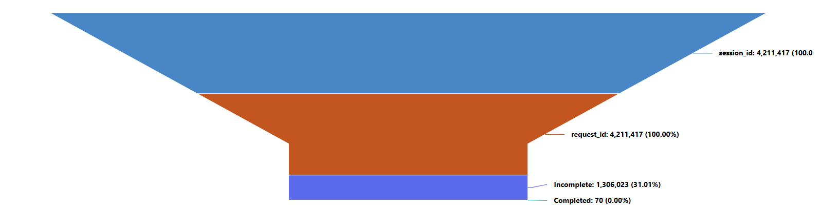
Funnel chart
A funnel chart visualizes a linear process that has sequential, connected stages. Each funnel stage represents a percentage of the total. So, in most cases, a funnel chart is shaped like a funnel, with the first stage being the largest, and each subsequent stage smaller than its predecessor.
The following example visualizes the progression of Server requests, showing the total number of sessions, requests, and their completion status. It highlights the drop-off from sessions to requests and the proportion of completed versus incomplete requests.
Example query
let stageOrder = datatable(Stage:string, Order:int)
[
    "session_id", 1,
    "request_id", 2,
    "Completed", 3,
    "Incomplete", 4
];

let base = TransformedServerMetrics
| where MetricType == "sqlserver_requests";

// Build the funnel table dynamically
let funnelData =
    union
    (base | where SQLMetrics == "session_id" | summarize Count = count() | extend Stage = "session_id"),
    (base | where SQLMetrics == "request_id" | summarize Count = count() | extend Stage = "request_id"),
    (base | where SQLMetrics == "percent_complete"
          | summarize Count = countif(Value == 100) | extend Stage = "Completed"),
    (base | where SQLMetrics == "percent_complete"
          | summarize Count = countif(Value < 100) | extend Stage = "Incomplete");

// Join with stage order and order properly
funnelData
| join kind=inner stageOrder on Stage
| order by Order asc
| project Stage, Count
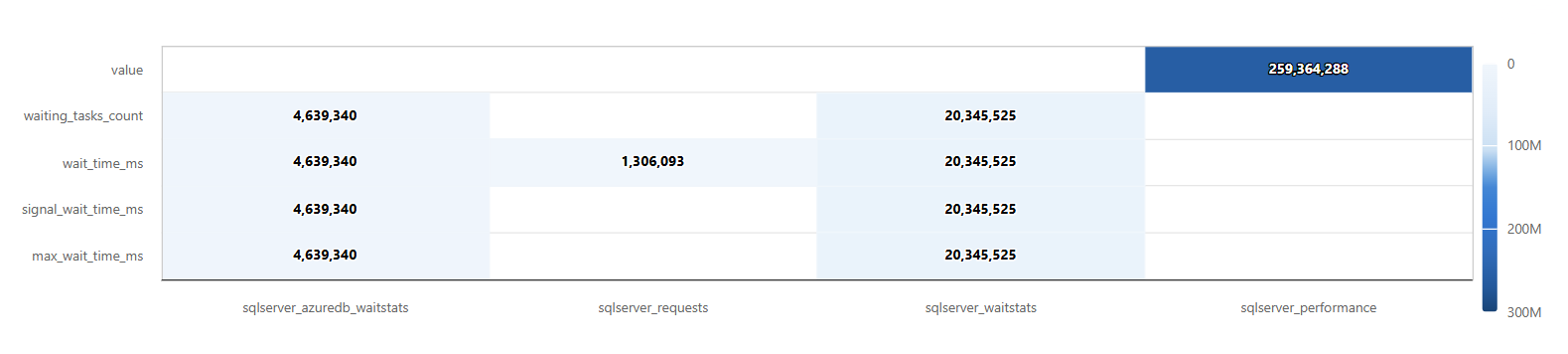
Heatmap
A heatmap shows values for a main variable of interest across two axis variables as a grid of colored squares.
To render a heatmap, the query must generate a table with three columns. The data used for the value field must be numeric. The columns that will be used for x and y values use the following rules:
- If the values in column x are in the
stringformat, the values in the column y must also be in thestringformat. - If the values in column x are in the
datetimeformat, the values in the column y must be numeric.
Note
We recommend specifying each data field, instead of letting the tool infer the data source.
The following example shows the distribution of the five most frequent SQL metrics across different metric types. It highlights which metric types are most common for each SQL metric, making it easy to identify activity patterns in the top metrics.
Example query
let topMetrics = TransformedServerMetrics
| summarize TotalCount = count() by SQLMetrics
| top 5 by TotalCount;  // pick only the 5 most common metrics

TransformedServerMetrics
| where SQLMetrics in (topMetrics | project SQLMetrics)
| summarize Count = count() by SQLMetrics, MetricType
| project X = MetricType, Y = SQLMetrics, Value = Count