Note
Access to this page requires authorization. You can try signing in or changing directories.
Access to this page requires authorization. You can try changing directories.
Learn how to see evaluation results in the Azure AI Foundry portal. View and interpret AI model evaluation data, performance metrics, and quality assessments. Access results from flows, playground sessions, and SDK to make data-driven decisions.
After you visualize your evaluation results, you can dive into a thorough examination. You can view individual results and compare these results across multiple evaluation runs. You can identify trends, patterns, and discrepancies, which helps you gain invaluable insights into the performance of your AI system under various conditions.
In this article, you learn how to:
- Locate and open evaluation runs.
- View aggregate and sample-level metrics.
- Compare results across runs.
- Interpret metric categories and calculations.
- Troubleshoot missing or partial metrics.
See your evaluation results
After you submit an evaluation, locate the run on the Evaluation page. Filter or adjust columns to focus on runs of interest. Review high‑level metrics at a glance before drilling in.
Tip
You can view an evaluation run with any version of the promptflow-evals SDK or azure-ai-evaluation versions 1.0.0b1, 1.0.0b2, 1.0.0b3. Enable the Show all runs toggle to locate the run.
Select Learn more about metrics for definitions and formulas.

Select a run to open details (dataset, task type, prompt, parameters) plus per-sample metrics. The metrics dashboard visualizes pass rate or aggregate score per metric.
Caution
Users who previously managed their model deployments and ran evaluations by using oai.azure.com, and then onboarded to the Azure AI Foundry developer platform, have these limitations when they use ai.azure.com:
- These users can't view their evaluations that were created through the Azure OpenAI API. To view these evaluations, they have to go back to
oai.azure.com. - These users can't use the Azure OpenAI API to run evaluations within Azure AI Foundry. Instead, they should continue to use
oai.azure.comfor this task. However, they can use the Azure OpenAI evaluators that are available directly in Azure AI Foundry (ai.azure.com) in the option for dataset evaluation creation. The option for fine-tuned model evaluation isn't supported if the deployment is a migration from Azure OpenAI to Azure AI Foundry.
For the scenario of dataset upload and bring your own storage, there are a few configuration requirements:
- Account authentication must be Microsoft Entra ID.
- The storage must be added to the account. Adding it to the project causes service errors.
- Users must add their project to their storage account through access control in the Azure portal.
To learn more about creating evaluations with OpenAI evaluation graders in the Azure OpenAI hub, see How to use Azure OpenAI in Azure AI Foundry models evaluation.
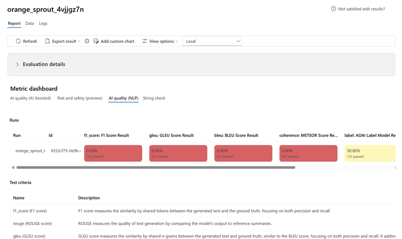
Metric dashboard
In the Metric dashboard section, aggregate views are broken down by metrics that include AI quality (AI Assisted), Risk and safety (preview), AI Quality (NLP), and Custom (when applicable). Results are measured as percentages of pass/fail based on the criteria selected when the evaluation was created. For more in-depth information on metric definitions and how they're calculated, see What are evaluators?.
- For AI quality (AI Assisted) metrics, results are aggregated by averaging all scores per metric. If you use Groundedness Pro, output is binary and the aggregated score is passing rate:
(#trues / #instances) × 100.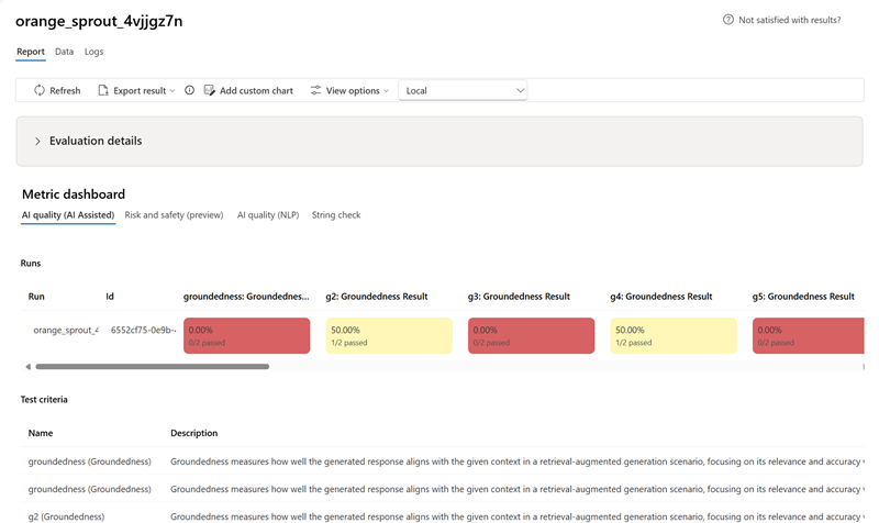
- For Risk and safety (preview) metrics, results are aggregated by defect rate.
- Content harm: percentage of instances exceeding severity threshold (default
Medium). - For protected material and indirect attack, the defect rate is calculated as the percentage of instances where the output is
trueby using the formula(Defect Rate = (#trues / #instances) × 100).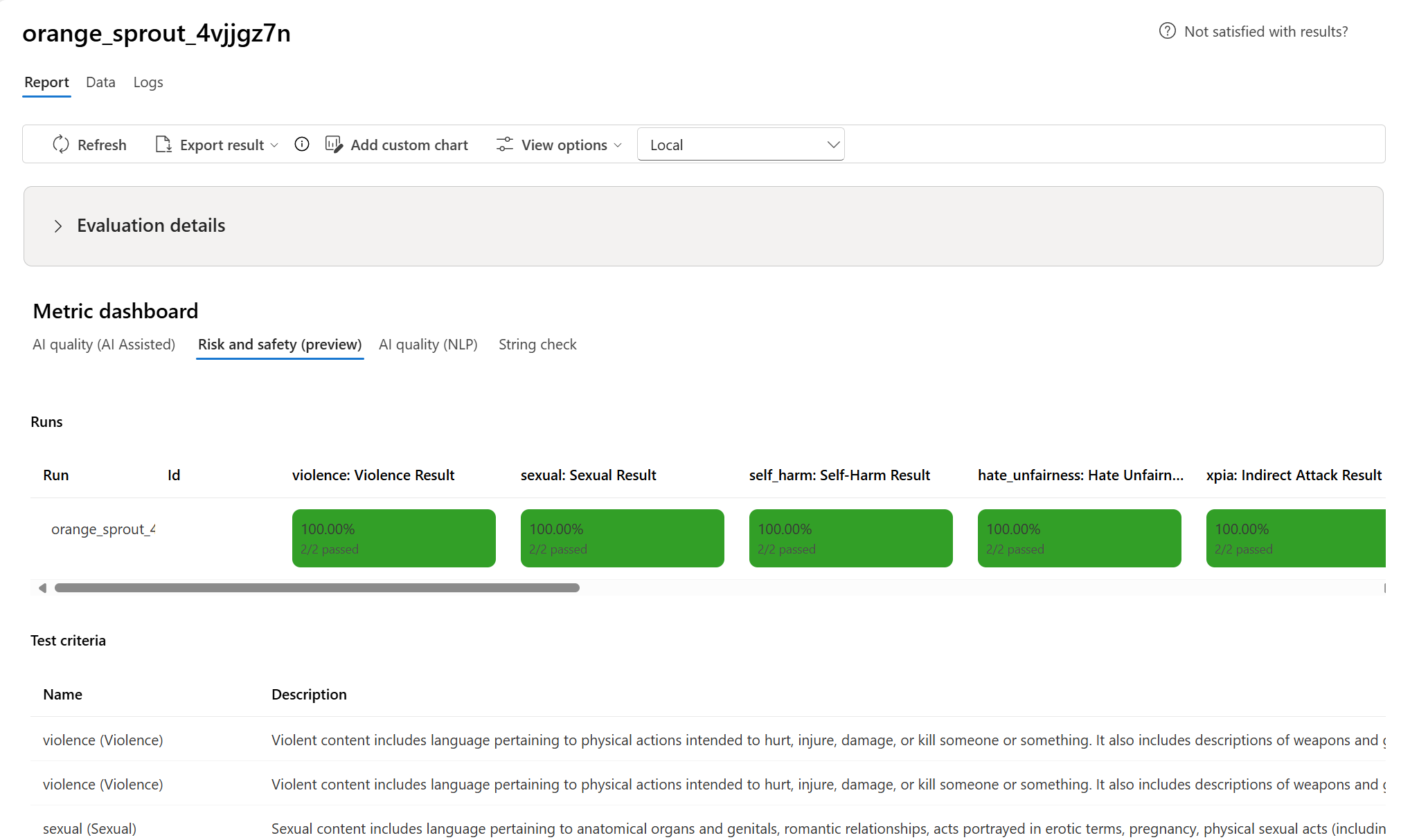
- Content harm: percentage of instances exceeding severity threshold (default
- For AI quality (NLP) metrics, results are aggregated by averaging scores per metric.


Detailed metrics result table
Use the table under the dashboard to inspect each data sample. Sort by a metric to surface worst‑performing samples and identify systematic gaps (incorrect results, safety failures, latency). Use search to cluster related failure topics. Apply column customization to focus on key metrics.
Typical actions:
- Filter for low scores to detect recurring patterns.
- Adjust prompts or fine-tune when systemic gaps appear.
- Export for offline analysis.
Here are some examples of the metrics results for the question-answering scenario:

Some evaluations have sub-evaluators, which allow you to view the JSON of the results from the sub-evaluations. To view the results, select View in JSON.

View the JSON in the JSON Preview:

Here are some examples of the metrics results for the conversation scenario. To review the results throughout a multi-turn conversation, select View evaluation results per turn in the Conversation column.

When you select View evaluation results per turn, you see the following screen:

For a safety evaluation in a multi-modal scenario (text and images), you can better understand the evaluation result by reviewing the images from both the input and output in the detailed metrics result table. Because multi-modal evaluation is currently supported only for conversation scenarios, you can select View evaluation results per turn to examine the input and output for each turn.

Select the image to expand and view it. By default, all images are blurred to protect you from potentially harmful content. To view the image clearly, turn on the Check blur image toggle.

Evaluation results might have different meanings for different audiences. For example, safety evaluations might generate a label for Low severity of violent content that might not align to a human reviewer's definition of how severe that specific violent content might be. The passing grade set during the creation of the evaluation determines whether a pass or fail is assigned. There's a Human feedback column where you can select a thumbs up or thumbs down icon as you review your evaluation results. You can use this column to log which instances were approved or flagged as incorrect by a human reviewer.

To understand each content risk metric, you can view metric definitions by going back to the Report section, or you can review the test in the Metric dashboard section.
If there's something wrong with the run, you can also use the logs to debug your evaluation run. Here are some examples of logs that you can use to debug your evaluation run:

If you're evaluating a prompt flow, you can select the View in flow button to go to the evaluated flow page and update your flow. For example, you can add extra meta prompt instructions, or change some parameters and reevaluate.
Compare the evaluation results
To facilitate a comprehensive comparison between two or more runs, you can select the desired runs and initiate the process. Select either the Compare button or, for a general detailed dashboard view, the Switch to dashboard view button. You're empowered to analyze and contrast the performance and outcomes of multiple runs, allowing for more informed decision-making and targeted improvements.

In the dashboard view, you have access to two valuable components: the metric distribution comparison Chart and the comparison Table. You can use these tools to perform a side-by-side analysis of the selected evaluation runs. You can compare various aspects of each data sample with ease and precision.
Note
By default, older evaluation runs have matching rows between columns. However, newly run evaluations have to be intentionally configured to have matching columns during evaluation creation. Ensure that the same name is used as the Criteria Name value across all evaluations that you want to compare.
The following screenshot shows the experience when the fields are the same:

When a user doesn't use the same Criteria Name in creating the evaluation, fields don't match, which causes the platform to be unable to directly compare the results:

Within the comparison table, you can establish a baseline for your comparison by hovering over the specific run that you want to use as the reference point and set as baseline. You can also activate the Show delta toggle to readily visualize the differences between the baseline run and the other runs for numerical values. Additionally, you can select the Show only difference toggle so that the table displays only the rows that differ among the selected runs, aiding in the identification of distinct variations.
By using these comparison features, you can make an informed decision to select the best version:
- Baseline comparison: By setting a baseline run, you can identify a reference point against which to compare the other runs. You can see how each run deviates from your chosen standard.
- Numerical value assessment: Enabling the Show delta option helps you understand the extent of the differences between the baseline and other runs. This information can help you evaluate how various runs perform in terms of specific evaluation metrics.
- Difference isolation: The Show only difference feature streamlines your analysis by highlighting only the areas where there are discrepancies between runs. This information can be instrumental in pinpointing where improvements or adjustments are needed.
Use comparison tools to pick the best performing configuration while avoiding regressions in safety or groundedness.

Measure jailbreak vulnerability
Evaluating jailbreak vulnerability is a comparative measurement, not an AI-assisted metric. Run evaluations on two different, red-teamed datasets: a baseline adversarial test dataset versus the same adversarial test dataset with jailbreak injections in the first turn. You can use the adversarial data simulator to generate the dataset with or without jailbreak injections. Ensure that the Criteria Name value is the same for each evaluation metric when you configure the runs.
To understand if your application is vulnerable to jailbreak, you can specify the baseline and then turn on the Jailbreak defect rates toggle in the comparison table. The jailbreak defect rate is the percentage of instances in your test dataset where a jailbreak injection generated a higher severity score for any content risk metric with respect to a baseline over the whole dataset size. You can select multiple evaluations in your Compare dashboard to view the difference in defect rates.

Tip
Jailbreak defect rate is comparatively calculated only for datasets of the same size and only when all runs include content risk and safety metrics.
Understand the built-in evaluation metrics
Understanding the built-in metrics is vital for assessing the performance and effectiveness of your AI application. By gaining insights into these key measurement tools, you're better equipped to interpret the results, make informed decisions, and fine-tune your application to achieve optimal outcomes. Refer to Evaluation and Monitoring Metrics to learn more about the following aspects:
- The significance of each metric
- How it's calculated
- Its role in evaluating different aspects of your model
- How to interpret the results to make data-driven improvements
Troubleshooting
| Symptom | Possible cause | Action |
|---|---|---|
| Run stays Pending | High service load / queued jobs | Refresh; verify quota; resubmit if prolonged |
| Metrics missing | Not selected at creation | Re-run selecting required metrics |
| All safety metrics zero | Category disabled or unsupported model | Confirm model + metric support matrix |
| Groundedness unexpectedly low | Retrieval/context incomplete | Verify context construction / retrieval latency |
Next steps
- Improve low metrics via prompt iteration or fine-tuning.
- Add tracing to diagnose latency or unexpected tool steps.
- Run evaluations in the cloud with the Azure AI Foundry SDK.
Related content
Learn more about how to evaluate your generative AI applications:
- Evaluate your generative AI apps with the Azure AI Foundry portal or SDK
- Create evaluations specifically with OpenAI evaluation graders in Azure OpenAI Hub
Learn more about harm mitigation techniques.